
A friend left his job in banking and decided to open a pizzeria with his mates. They were quite successful, and within a few years they went from 1 restaurant to 8. As this happened, they gradually went from running individual restaurants to macro managing them remotely. To help them do so, they built a realtime view of all the pizzerias.
Inspired by their experiences, an idea appeared when we came across the New York City taxi dataset. We thought: How would business analytics look for the NYC taxi business? Could we monitor it in real-time? How would it look?
To answer this, we constructed a pseudo-realtime dashboard to test the concept. The graph uses real data from New York City cabs, replayed with an offset of a few years to simulate streaming data. Let's see how it works.
See the NYC Taxi Grafana dashboards in real-time.

How to simulate real-time data
Unfortunately, we do not have access to true real-time data for NYC taxis. To simulate "real-timely-ness", we instead tune data from real historical files.
To do so, the data is loaded into QuestDB and then the queries are run against the current time, offset by 8 years.
To import the data into QuestDB, first download the parquet files for the intervals you are interested in from the above address. Then, we can use the python client to insert the rows into a QuestDB table in just a few lines of code:
import pyarrow.parquet as pq
from questdb.ingress import Sender

path = 'PATH_TO_YOUR_FILES'
fileName = 'NAME_OF_YOUR_FILE'
trips = pq.read_table(f'{path}{fileName}.parquet').to_pandas()

with Sender('localhost', 9009) as sender:
    for index,row in trips.iterrows():
        sender.row(
            'trips',
            symbols={},
            columns={'VendorID': row['VendorID'],
                     'dropoff_datetime': row['tpep_dropoff_datetime'],
                     'passenger_count': row['passenger_count'],
                     'trip_distance': row['trip_distance'],
                      .....[OTHER FIELDS]
                      },
            at=row['tpep_pickup_datetime'])

    sender.flush()
We can simulate the offset to current time in two steps:
First we filter the tables using an offset against the current time. For example, to simulate the last 5 minutes of taxi rides:
SELECT
    xyz
FROM
    trips
WHERE
    pickup_datetime BETWEEN dateadd('m', -5, dateadd('y', -8, now()))
    AND dateadd('y', -8, now())
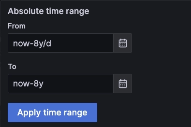
Second, we adjust the Grafana time window to match our target. For example, for a chart covering the whole day up to the current time, but 8 years ago, we use now-8y/d as start, and now-8y as end points:
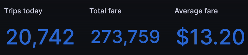
Building ticking metrics
The first thing we wanted was a set of ticking metrics to show the health of our "business" so far "today" -- err 8 years ago. A strong start is to get the count of trips so far today:
SELECT
    count() AS trips
FROM
    trips
WHERE
    pickup_datetime BETWEEN dateadd('y', -8, timestamp_floor('d', now()))
    AND dateadd('y', -8, now())
Next we replicated the query to get total fare, average fare, total trip distance and so on:
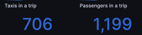
After that, we wondered if we could simulate how many taxis and passengers are
currently in a trip. The data only shows one line per trip and the designated
timestamp is pickup_datetime.
If we wanted to filter directly on dropoff_datetime it would make queries
significantly slower as this is not a designated timestamp field. Instead we
took all the trips that started within a 2 hour window but were not yet
finished... as of the current time, eight years ago:
SELECT
    count()
FROM
    trips
WHERE
    pickup_datetime BETWEEN dateadd('h', -2, dateadd('y', -8, now()))
    AND dateadd('y', -8, now())
    AND dropoff_datetime > dateadd('y', -8, now())
In a similar way, we applied sum(passenger_count) instead of count() to get
the simulated number of passengers currently in a trip:
Let the rides flow!
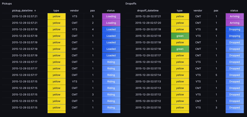
The next step is ambitious. Could we construct an overall view of the rides flow? Whenever a pickup or a dropoff is happening, alongside other metrics such as passenger count, the cab type and other key indicators?
Sure we can. We can use similar logic for filtering by pickup_datetime and for
dropoffs, and then apply further filtering on dropoff_datetime.
To highlight the recent rides, a status based on how recently the trip started
with a case statement will work. For instance, timestamp_floor('d',now())
filters all rides from today, then ORDER BY gets the most recent rides.
From there, truncate to 100 results:
SELECT
    pickup_datetime,
    cab_type,
    vendor_id AS vendor,
    passenger_count AS pax,
    CASE
        WHEN (dateadd('y', -8, now()) - pickup_datetime) / 1000000 < 1.2 THEN 'Loading'
        ELSE
            CASE
                WHEN (dateadd('y', -8, now()) - pickup_datetime) / 1000000 < 2.2 THEN 'Loaded'
                ELSE 'Riding'
            END
    END AS ride_status
FROM
    trips
WHERE
    pickup_datetime BETWEEN dateadd('y', -8, timestamp_floor('d', now()))
    AND dateadd('y', -8, now())
ORDER BY
    pickup_datetime DESC
LIMIT
    100
Similarily for dropoffs and with applying some value mappings to generate cell colors in Grafana, we end up with the following view that replays the flow of rides as if in real-time:
Accumulating valuable business metrics
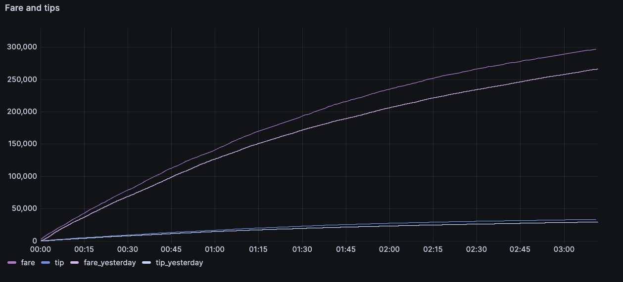
We're simulating business, here! What else is essential to our prospective taxi empire? What about cumulative metrics, such as the total amount of fares received today, tips, distance, and that sort of thing?
We apply two Grafana queries with different windows to compare the results for today and the previous day:
WITH x AS
(
    SELECT
        pickup_datetime,
        sum(fare_amount) OVER (ROWS BETWEEN UNBOUNDED PRECEDING AND CURRENT ROW) AS fare,
        sum(tip_amount) OVER (ROWS BETWEEN UNBOUNDED PRECEDING AND CURRENT ROW) AS tip
    FROM
        trips
    WHERE
        pickup_datetime BETWEEN dateadd('y', -8, timestamp_floor('d', now()))
        AND dateadd('y', -8, now())
)
SELECT
    x.pickup_datetime,
    last(x.fare) AS fare,
    last(x.tip) AS tip
FROM
    x
SAMPLE BY
    1m
The above uses sum() over() to calculate the cumulative sum of fares and tips
received. Since the query could return hundreds of thousands of rows, we use
SAMPLE BY 1m with the last() point to down-sample to one-minute intervals
and reduce the points Grafana needs to draw on the chart.
The result is as follows, and it updates throughout the day:
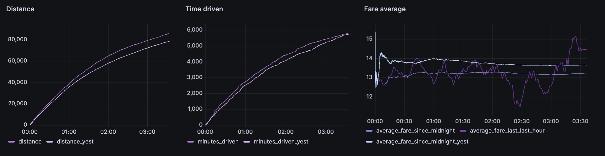
The same logic can then be applied to multiple other metrics, like distance driven, average fare, time driven, cumulative rides and cumulative passengers:
Figuring out tips
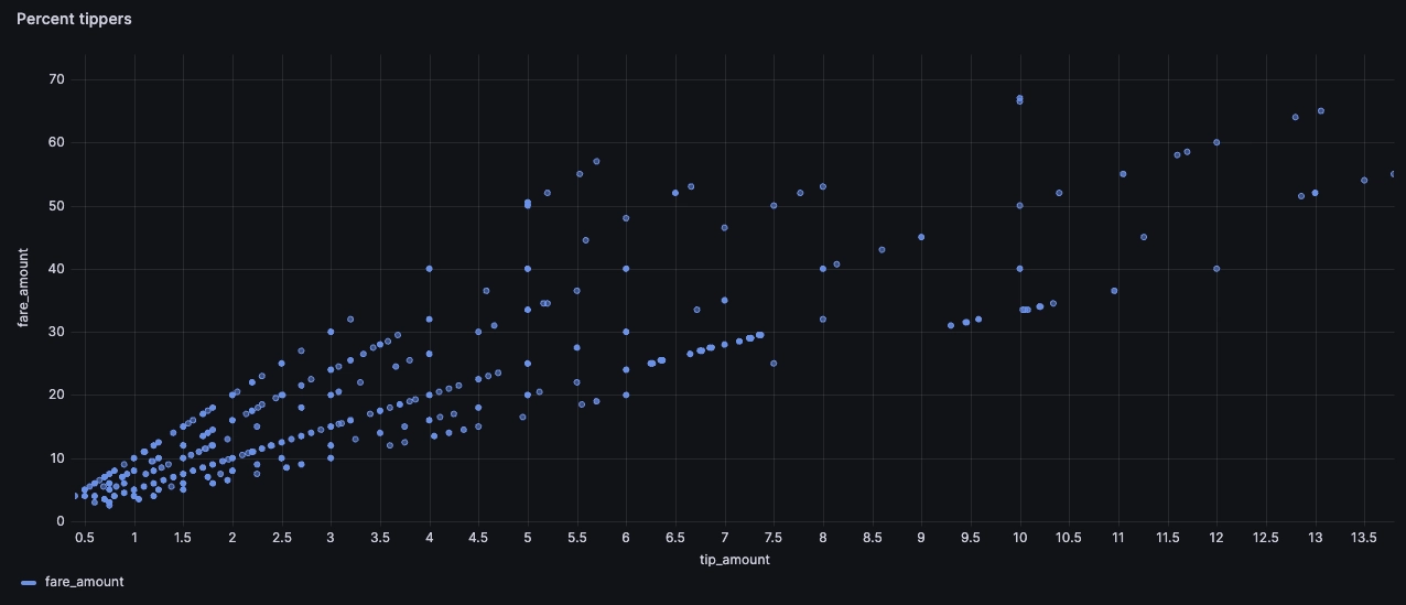
Ahh... Tipping. Very contentious these days! The tip is most interesting to unpack. What influences tipping tendencies? Does a driver get more tips for driving faster or for taking night rides or for picking up rides in certain areas? There are many possible ways we can approach this, but an XY plot felt most visually impactful.
SELECT
    tip_amount,
    fare_amount
FROM
    trips
WHERE
    pickup_datetime BETWEEN dateadd('y', -8, timestamp_floor('d', now()))
    AND dateadd('y', -8, now())
    AND fare_amount < 70
    AND tip_amount < 15
In the above query, we use some filters to remove outliers such as
fare_amount<70:
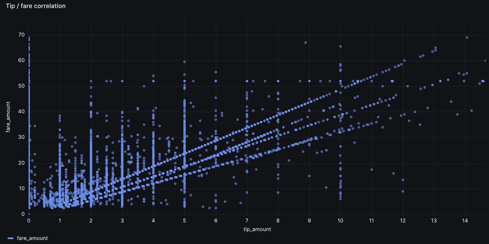
There's many compelling insights:
- Some people tip 0, oof!
- Some people tip a percentage of the fare, shown via the straight diagonal lines. Though none of us have been to NYC, we assume that the payment systems in the cab suggest different tip amounts, and that these lines reflect the various possible tip percentages. Perhaps this sort of chart has influenced the ever-creeping minimum tip percentage...
- Some tip a flat round value, like $5 or $10
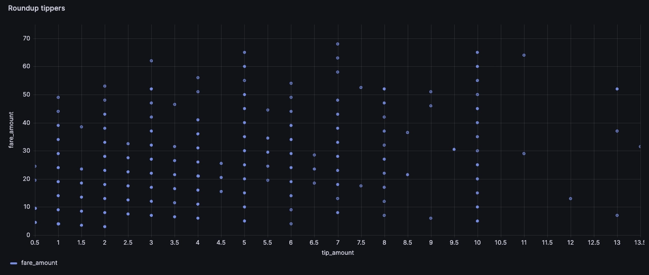
- There is another likely dimension, which is the 'round up' tip, so that the overall value is a round number, though it's harder to see on the chart below:
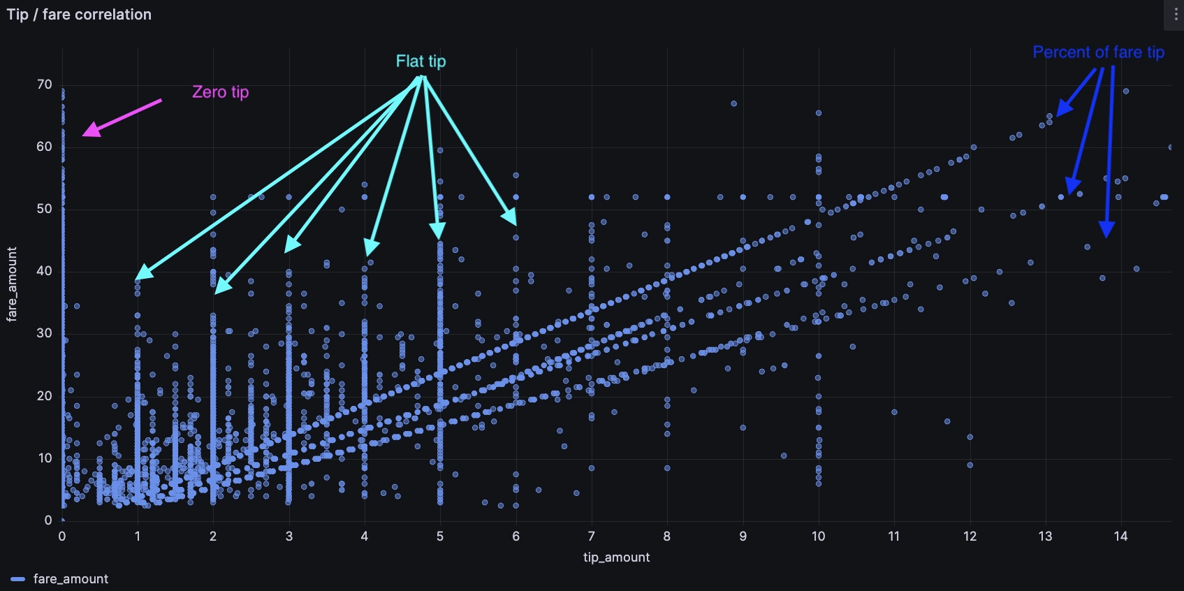
To check, we can separate the different groups with a few SQL filters. For example, the following will highlight the tips that round up the fare to a multiple of $5 or $10:
SELECT
    tip_amount,
    fare_amount
FROM
    trips
WHERE
    pickup_datetime BETWEEN dateadd('y', -8, timestamp_floor('d', now()))
    AND dateadd('y', -8, now())
    AND fare_amount < 70
    AND tip_amount < 15
    AND tip_amount > 0.1
    AND
    (
        (fare_amount + tip_amount) - 10 * cast((fare_amount + tip_amount) / 10 as int) < 0.01
        OR
        (fare_amount + tip_amount) - 10 * cast((fare_amount + tip_amount + 5) / 10 as int) + 5 < 0.01
    )
Again, similar logic can help us find tips that are a certain percentage of the fare amount, such as 12.5% and 20%:
SELECT
    tip_amount,
    fare_amount
FROM
    trips
WHERE
    ...
    AND
    (
        abs(tip_amount / fare_amount - 0.1) < 0.005
        OR abs(tip_amount / fare_amount - 0.125) < 0.005
        ...
    )
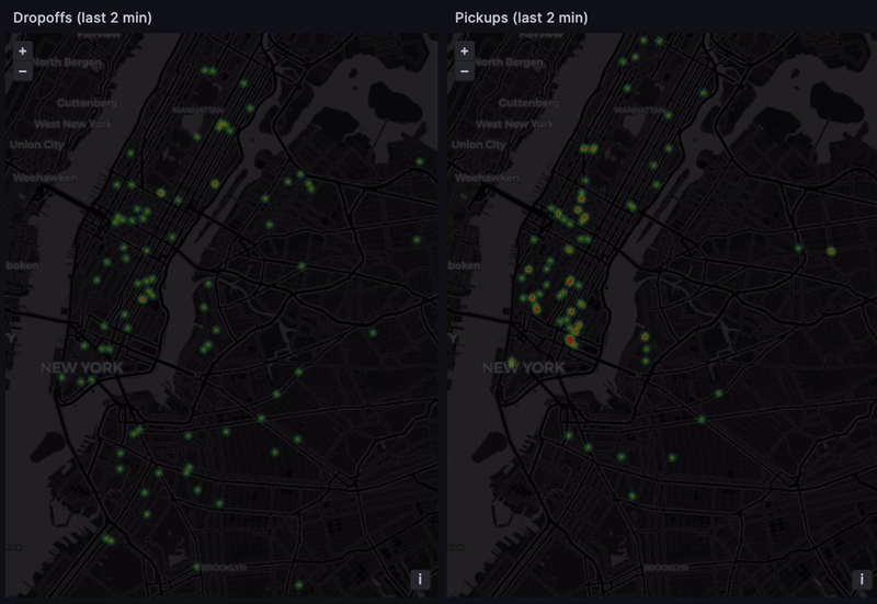
Finding hot spots
If we operated a fleet of taxis, we'd be very interested in the passenger hot spots. A hot spot is an area with many pickups/dropoffs. There's the obvious, like an airport or a major tourist spot like Broadway. But there could be hot new venues or emerging restaurants, and getting there first gives us an edge.
A Grafana heatmap with the pickup and dropoff coordinates to highlight recent activity does the trick:
SELECT
    dropoff_datetime,
    dropoff_latitude,
    dropoff_longitude
FROM
    trips
WHERE
    pickup_datetime BETWEEN dateadd('h', -4, dateadd('y', -8, now()))
    AND dateadd('y', -8, now())
    AND dropoff_datetime BETWEEN dateadd('m', -2, dateadd('y', -8, now()))
    AND dateadd('y', -8, now())
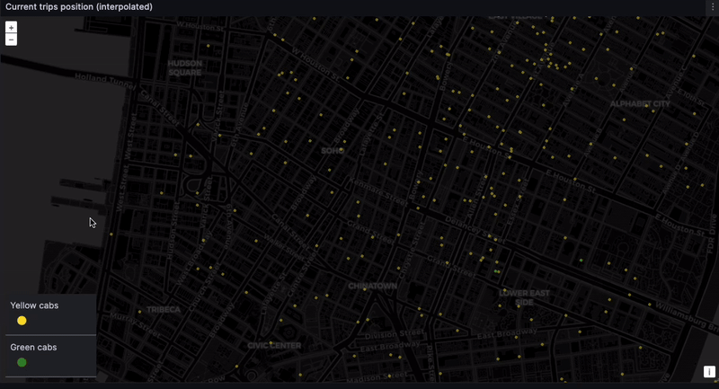
Tracking real-time taxi geodata
And finally... the dashboard. The location of every taxi, at every moment. The eye in the sky. Big brother! This is difficult to do with high precision because the NYC taxi dataset only contains pickup and dropoff coordinates. But we can get something representative through time-based interpolation. In a real-world scenario, GPS coordinates would provide the needed precision.
Calculate the ride duration and interpolate between the pickup and dropoff point based on how much time has elapsed:
WITH data AS (
    SELECT
        cast(datediff('s', pickup_datetime, dateadd('y', -8, now())) AS float)
        / cast((datediff('s', pickup_datetime, dropoff_datetime)) AS float) AS progress,
        pickup_latitude,
        pickup_longitude,
        dropoff_latitude,
        dropoff_longitude
    FROM
        trips
    WHERE
        pickup_datetime BETWEEN dateadd('h', -2, dateadd('y', -8, now()))
        AND dateadd('y', -8, now())
        AND dropoff_datetime > dateadd('y', -8, now())
        AND cab_type = 'yellow'
)
SELECT
    pickup_latitude + (dropoff_latitude - pickup_latitude) * progress AS current_latitude,
    pickup_longitude + (dropoff_longitude - pickup_longitude) * progress AS current_longitude
FROM
    data
Admittedly, this is a naive interpolation. But we do want to see the taxis moving. While we can expect some inconsistencies, such as cars going over water and through buildings…
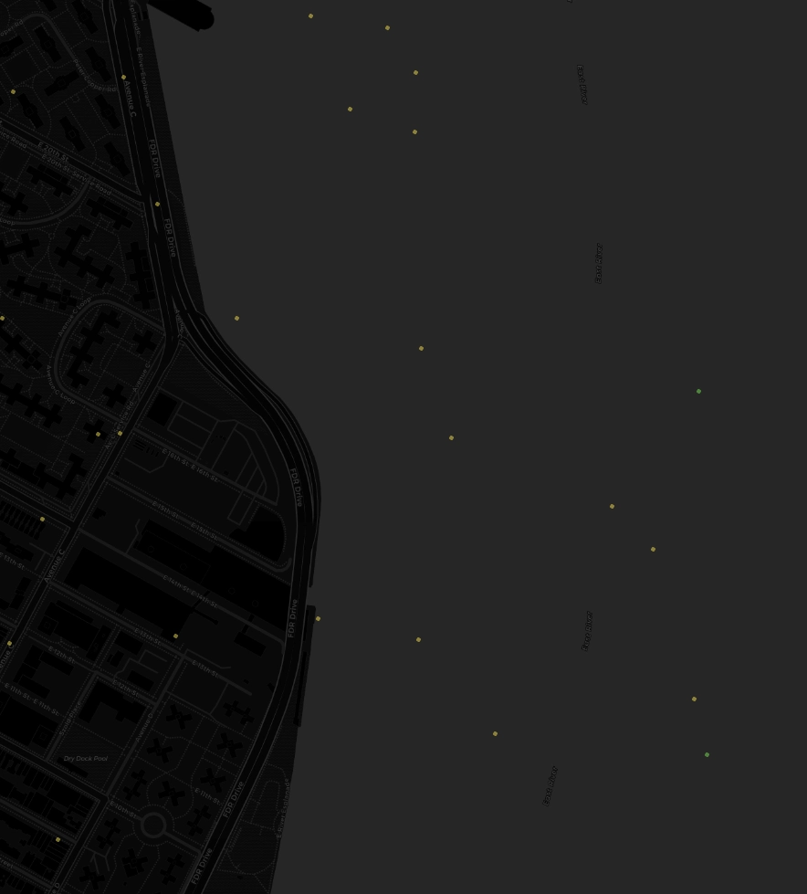
... We can still get a rough sense of where cabs are gravitating. Given we lack real-time data, seeing taxis scoot through their routes is still very satisfying:
Summary
Our inspiration took us on an exploration of the New York City taxi industry. Using historical taxi data, we simulated a real-time business dashboard. Through time-based interpolation, we visualized the approximate locations and movements of taxis, offering a bird's-eye view of the city's taxi flow.
While clean and specific data would lead to stronger analysis, our demo showcases the power of data visualization in understanding and managing a business. It gave us a glimpse into the daily ebb and flow of New York City's iconic taxi industry.
For data ingest and analysis, QuestDB and Grafana make an excellent pair. If you're looking to interpret massive flows of data and to compose dashboards of your very own, consider downloading QuestDB. It's open source!