
What's the difference between finance and high-frequency finance?
I like to think of this question as taking a microscope to finance data and magnifying everything up to see the nitty-gritty. Most people start by downloading daily stock prices from something like Yahoo or Google finance. For some applications, this type of data is enough if you are looking at long-term trends or say differences between countries, but a whole other world is lurking underneath those four daily prices.
In the not-so-distant past, getting your hands on more granular data was either expensive or out of reach to the hobbyist, but there has since been a revolution thanks to crypto. Now, many crypto exchanges provide their data for free and this combined with some excellent open-source (and free) tools allow you to build your own little high-frequency research labs.
This tutorial will hold your hand and introduce you to the concepts of high-frequency finance and what makes it different. If you are finance-curious this is the tutorial for you and with Julia and QuestDB I will highlight some of the basic concepts behind modern data-driven finance.
This tutorial is broken down into the following sections:
- The dataset: what kind of data are we working with?
- Prices: what does a high-frequency price source look like?
- Returns: how do we prepare the data for analysis and how are the returns distributed?
- Correlations: what does the correlation look like between returns?
- Trades: how can we measure price impact using high-frequency trades?
Creating a dataset of crypto trades from Coinbase
I've written about hooking up to the Coinbase API and storing the results in QuestDB. It's a technical post and you can read the tutorial here. By using the same process as highlighted in that post, I have stored Bitcoin-USD exchange rate data and trade data from 09:00 on the 24th of July 2021 to 14:30 on the 25th of July 2021.
All the data comes from Coinbase, one of the largest crypto exchanges, and gives a good picture of what the market looks like. We will be using both the price data and the trade data to perform our analysis.
For convenience, these datasets are made available on S3 and can be loaded into a running QuestDB instance using the REST API:
# Download the example data
curl https://s3.eu-west-1.amazonaws.com/questdb.io/datasets/hff-tutorial/prices.csv --output prices.csv
curl https://s3.eu-west-1.amazonaws.com/questdb.io/datasets/hff-tutorial/trades.csv --output trades.csv
# Import prices
curl -F schema='[{"name":"timestamp", "type": "TIMESTAMP", "pattern": "yyyy-MM-ddTHH:mm:ss.SSS"}]' \
-F data=@prices.csv 'http://localhost:9000/imp?×tamp=timestamp'
# Import trades
curl -F schema='[{"name":"timestamp", "type": "TIMESTAMP", "pattern": "yyyy-MM-ddTHH:mm:ss.SSS"}]' \
-F data=@trades.csv 'http://localhost:9000/imp?×tamp=timestamp'
Understanding high frequency prices
If we go to Yahoo finance and look at the historical data of Apple you can see open, high, low, and close prices. Each represents a different value of the stock price at a different time, and gives us an idea of how the price moved throughout the day.
High-frequency finance is different from this as there is not one price, but two different prices:
- The bid price that represents how much you will pay if you are buying.
- The ask price, that represents how much you will receive if you are selling.
We can plot a small snapshot of the bid and ask prices to see how they change.
ticks = minimum(exampleData.timestamp):Millisecond(10):maximum(exampleData.timestamp)
tick_labels = Dates.format.(ticks, "HH:MM:SS.sss")

examplePlot = plot(exampleData.timestamp, exampleData.bid,
                   label = "Bid", seriestype=:steppre,
                   markershape = :circle, markercolor = :auto,
                   xticks = (ticks, tick_labels), legend=:bottomleft)
examplePlot = plot!(examplePlot, exampleData.timestamp, exampleData.ask,
                    label = "Ask", seriestype = :steppre,
                    markershape = :circle, markercolour = :auto)
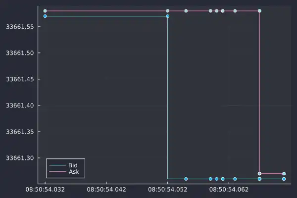
In the space of 30 milliseconds, we can see 8 updates, each shown as a point on this graph. There are a two things to note from this chart:
-
There are irregular spacing between the updates because times at which the prices update are random.
-
The bid or ask can change independently. Both the bid and ask can change when they want and not always at the same time.
So why does the Yahoo daily data only refer to one price? The Yahoo data is ignoring that you buy and sell at different prices but instead reporting the mid-price.
The mid-price is the average of the bid and ask and thus incorporates changes in both the bid and ask price. At low-frequency levels (like Yahoo Finance), the difference in bid and ask is so small it doesn't make a difference. But at a high-frequency level, you need to be aware of how it is calculated and how changes based on the bid and ask price changes.
We can add the mid-price into the above plot and again note some interesting results.
exampleData = @transform(exampleData, mid = (:ask .+ :bid) /2)

plot!(examplePlot, exampleData.timestamp, exampleData.mid, label = "Mid",
      seriestype = :steppre, linecolour = :auto)
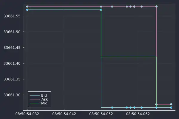
In this short window of time, we now have three unique mid prices, but only two
actual prices you can trade at. At 08:50:54.052, the mid-price drops because
of the drop in the bid price. The ask price remained the same for another 6
updates.
The mid-price responds to changes in both the bid and ask and can obscure what is happening behind the data. The mid-price might change, but that doesn't mean both the price you buy and sell at has changed.
Low-frequency historical data (like Yahoo finance) is good for a general sign of the stock price, but ultimately, the underlying data is different. There is a whole world of interaction behind those high, low, open, and close prices. Hopefully, this has piqued your interest and you can see why we need to the specific term high-frequency finance to study this new type of data.
Now, I'm making a song and dance how the mid-price doesn't exist and there isn't
one singular price at each time, but we find in most cases the mid-price is good
enough for the type of analysis we are about to do. Now by using our original
table coinbase_bbo we need to add in the mid-price. We need to create a new
table with this calculated variable.
execute(conn,
"
CREATE TABLE mid_table
AS(
    SELECT timestamp, ask, asksize, bid, bidsize,
    (ask + bid) / 2 as mid,
    (asksize * ask + bidsize * bid) /(asksize + bidsize) as wmid
    FROM coinbase_bbo)
")
This is still the same number of rows though, as we want to aggregate the mid-price to one-second intervals by taking the average value in that bucket. We are losing the 'irregularity' of high-frequency data, but as we saw in the example graph, 1 second is still a high enough fidelity to see some interesting things.
This is where we use the SAMPLE BY function of QuestDB. This allows you to
choose a period of time and aggregate the data into a bucket of that size. In
our case 1s - so 1 second. We calculate the average mid-price over one second
and call that column avg_mid.
bbo = execute(conn,
    "SELECT timestamp,
    avg(mid) as mid_avg FROM mid_table
    SAMPLE BY 1s") |> DataFrame
dropmissing!(bbo);
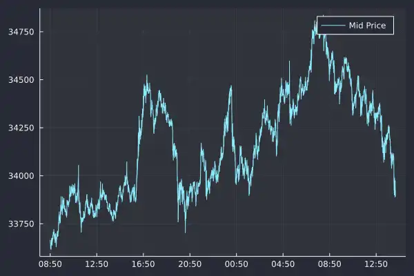
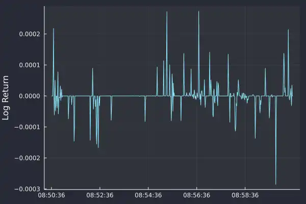
Here we have plotted the high-frequency mid-price over our entire dataset. Distinctly different from the historical Yahoo finance data as we have roughly 100,000 rows covering around 18 hours. It is this mid-price at every second that we will use to continue our exploration of high-frequency finance.
Introduction to financial returns
So we have our aggregated price but we need to perform another transformation before we can continue our analysis. When we look at our mid-price plot we see that it goes through different levels.
Early on the price is below $34,000 before increasing to $34,750; we need to know what time of day it is to understand what level the price is. This means that it is not stationary, so to overcome this issue, we need to transform the mid-price into something stationary (or at least more stationary) which is where the concept of returns arrives.
The return over each period is the percentage change
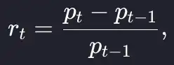
which we translate into Julia code as:
returns = [(bbo.mid_avg[i] - bbo.mid_avg[i-1]) / bbo.mid_avg[i-1] for i in 2:nrow(bbo)]
bbo = @transform(bbo, returns = [NaN; returns])
As each row represents one second, this is the one-second return time series. When we plot the first 10 minutes of 1-second returns we see that it is more stable than the mid-price.
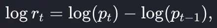
Unlike the price, there is no obvious level at which the returns are hovering. The average is around zero and with periods of positive and negative returns. Now it is more conventional to work in log-returns which is the logarithm of the above formula, which we write as a simple equation:
Again, when translated to Julia code is even simpler:
bbo = @transform(bbo, logreturns = [NaN; diff(log.(:mid_avg))])
It is conventional to work in log-returns as you can add them across time periods to arrive at the total return. With simple returns, you have to multiply each period. But, at such small time frames (in our case one second intervals) small return values the log-returns are similar to the simple returns, so in truth it doesn't matter much. The distribution of log-returns has a reassuringly nice distribution:
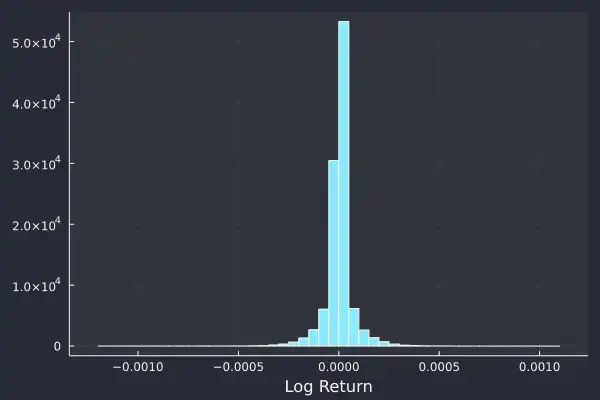
We can immediately pull out some key features.
-
The center of the distribution is zero, or close enough.
-
The average looks constant throughout the day and indicates some degree of stationarity in the log-returns.
-
Large values occur but they are rare.
This is the fat tail phenomenon where the tails of a probability distribution is larger than you expect and thus extreme values happen more regularly than typical probability distributions would describe. Most of the values are between ±0.0005, but values of 0.001 (so twice as large) did happen.
These large tails are a defining feature of finance and not restricted to high-frequency data. There are many examples where an extreme event has rippled through the financial system, Black Monday (19/10/1987) saw the Dow Jones Industrial Average fall by 22%, before that the largest ever decrease was in 1929 at 12%, so quite the difference in returns.
We can quantify this heavy tail behaviour with some statistics. The kurtosis of a distribution describes the tail behaviour, with a value less than 3 indicating 'thin tails' and thus fewer outliers or large events than the normal distribution. A kurtosis value of greater than 3 indicates 'fat tails' and as you guessed, more likely to generate outliers. 3 is the magic number as this is the kurtosis of the normal distribution, so the excess kurtosis is the kurtosis minus three.
Let's calculate the mean, standard deviation, and excess kurtosis on our log
returns. In Julia, we use the mean, std, and kurtosis function from the
Statistics library.
| Statistic | Value |
|---|---|
| Mean | 7 x 10^-8 |
| Standard Deviation | 7 x 10^-5 |
| Excess Kurtosis | 15 |
With a large excess kurtosis of 15, as we expected, this is proof that these log-returns are heavy-tailed. Large events are more likely to happen than we would think.
Correlation and time series autocorrelation
So far, we've transformed the prices into returns so that we are looking at a stationary time series. We investigated what the distribution of this time series looked like and found that its average was close to zero and it had a large excess kurtosis and thus is fat-tailed.
Now we want to look at the correlation between these returns and see what we can learn from this type of analysis. When we talk about correlation we mean autocorrelation which is the correlation between each value and values further on in the time series.
We calculate the correlation between every value and the next value to arrive at the 'lag 1 correlation', we then calculate the correlation between every value and the second next value to give us the 'lag 2 correlation'. We can keep on going for as many lags as we like to produce an autocorrelation plot.
Actually calculating the autocorrelation is hidden behind the autocor function
in Julia:
acf = autocor(bbo.logreturns[2:end])

plot(acf[2:end], seriestype=:scatter, label = "Autocorrelation",
     xlabel="Lag", ylabel = "Correlation")
hline!(return_acf, [-1, 1] .* 1/sqrt(nrow(bbo) - 1),
       label = "Confidence")
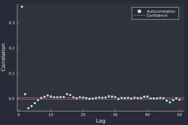
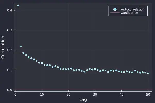
Here we have calculated the autocorrelation plot on the Bitcoin log-returns and at the smaller lags, there is some statistical significance. At lag 1, the value of about 0.35 shows that a large return is likely followed by another large return of the same sign, so positive returns follow positive returns and likewise for negative.
There is a slight negative correlation at lags 3, 4, and 5 which indicates that after the initial log-return there is some indication of mean reversion, i.e. returns of the opposite sign. All very interesting and shows that there is some slight predictability in the return pattern and after every log-return, we have a reasonable idea of what the next few log-returns might look like.
Once we go beyond 10 lags though there is no statistical significance, which suggests that each log-return has a short lifespan and disrupts the market for less than 10 seconds.
We can also look at the autocorrelation on the absolute returns, so by stripping out the sign of the returns is there a change in the correlation structure?
acf = autocor(abs.(bbo.logreturns[2:end]))
Now things take an interesting turn. All lags are significant and more so that they are positive. This indicates that large values follow large values of either sign, so a large positive log-return is likely to be followed by a similar large log-return of either positive or negative. This effect slowly decays and lasts for a long time.
When we take logs of both the axis we see the following straight line
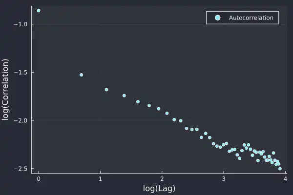
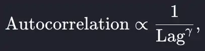
which indicates that the autocorrelation of the absolute returns follows a power law;
and power-law distributions are fat-tailed. So what we discovered about the distribution of the returns is also true for the autocorrelation, outliers are expected. Furthermore, this shows that there is long-term memory over time, the notion that large returns lead to other large returns persists in the market for a long time.
Here it is 50 lags (so 50 seconds) but the power-law indicates that it will continue for a long time. This all points to the presence of regimes where there are periods of large returns and likewise, periods of small returns. This gives a semblance of predictability, at least at the high-frequency level but also shows how similar sizes of returns are grouped.
This is where we can start to think about volatility, or how the variation of returns changes. This correlation of absolute returns shows that the underlying volatility (or variation) in returns is not stationary.
The study of volatility of returns is a whole theme in itself and we will look at calculating volatility at a later date. This is where we come to a close with looking at high-frequency prices and move onto high-frequency trades.
Analyzing crypto trades and using empirical price impact
When people buy or sell some Bitcoin at Coinbase it is recorded and broadcasted, and I've shown you how to store this data in the previous tutorial. This data is useful for looking at irregularly-spaced events as each trade occurs at a random time. This satisfies our condition for the high-frequency data classification.
Trades also happen at an extraordinary rate; in our sample, we have over 200k trades in the same period of the tick data above (18 hours). We are interested in the price of each trade, whether it was a buy or sell, and finally what time it happened. This is easy to extract from our QuestDB database:
@time trades = execute(conn,
"SELECT timestamp, price, size, side FROM coinbase_trades") |> DataFrame
dropmissing!(trades);
Recorded trades represent the actual price at which some Bitcoin has changed hands and is more tangible than our previous dataset which was indications where people might buy or sell Bitcoin. If you are buying or selling Bitcoin, you want to make sure you get the best possible price.
This is quite an open-ended problem that is fraught with difficulty in deciding
what means 'best'. A simple method of judging though is comparing the price you
paid with the price of the next trade. But why stop at the next trade, you can
look at the next l trades to understand how the price evolved after each
trade.
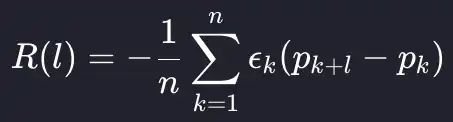
This leads us to calculate the empirical price impact function, which averages the impact at each lag to build up an empirical picture of price evolution over time. As an equation, we are taking an average over the different lags of the trades data frame.
As this is an empirical measure, we are also going to classify the size of the trades into small, medium, and large using the quantiles of the trade size. We will see how the price impact functions change based on trade size. Ultimately, we expect larger trades to have a greater price impact and this to reflect in the price impact function.
This all comes down to supply and demand; a larger trade disrupts the balance of supply and demand more than the smaller trades and thus its effects will be felt for longer. To calculate this price impact in Julia we first add a log price to the trades dataframe:
trades = @transform(trades, logprice = log.(:price))
We now calculate the boundaries for our trade size classification.
sizeF = cut(trades.size, quantile(unique(trades.size), 0:(1/3):1), extend = true, labels = ["Small", "Medium", "Large"])
- Small trades: < 0.0028 which is about $95
- Medium trades: > 0.0028 but < 0.014
- Large trades: > 0.014, about $480
And now we can calculate the log returns between the trades at different lags. We are going to look at a maximum of 2500 lags.
r_diffs = [-1 .* trades.side .* (lag(trades.logprice, k) - trades.logprice) for k in 1:2500]
lagframe = DataFrame(hcat(r_diffs...), :auto)
lagframe[!, :SizeGroup] = sizeF
dropmissing!(lagframe);
Before finally converting it from a wide format to a long format using stack.
lagFrameTidy = stack(lagframe, 1:2500);

gdata = groupby(lagFrameTidy, [:SizeGroup, :variable])
sdata = combine(gdata, :value => mean, :value => std, :value => length)
sdata[!, :lag] = parse.(Int64, chop.(sdata.variable, head = 1, tail = 0))
We plot the log-return against the lag and again, we see a power law:
plot(sdata.lag, sdata.value_mean,
     group = sdata.SizeGroup,
     ribbon = 1.96 .* sdata.value_std ./ sqrt.(sdata.value_length),
     xlabel = "Lag", ylabel = "Impact", legend=:bottomright)
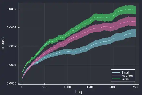
Importantly, we can see the confirmation of our hypothesis, larger trades have a greater impact on future trades and likewise, smaller trades have the least impact.
We've added the standard error on the calculation of the impact and glad to see it grow over time, as there is more variation at larger lags. If we zoom into 20 lags we can see this price impact effect even clearer:
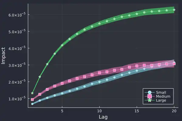
The first price difference is similar for all three trade types, around
1 x 10^-5, but 5 trades later, the price difference is starkly different, the
large trade has had much more market impact. The large trades have caused the
price to move that much more.
This is all empirical evidence, we have taken the data presented to us and managed to prove that trading large amounts is more likely to move the price than a smaller trade amount. Again, as this is high-frequency the average timescales are small, the average time difference between trades is 500ms and the median is 154ms but very relevant for anyone making lots of trades, knowing that the larger ones will be pushing the price more.
What we learned about high-frequency finance
That concludes our whistle-stop tour of different aspects of high-frequency finance. Hopefully, I have convinced you why this type of data is different from your typical daily data and how there are all sorts of interesting phenomena underneath the surface.
I've highlighted the two prices, the bid and the ask, plus how we combine them to form the mid-price. We've then seen how this mid-price is not stationary and instead converted it to returns and then log-returns which is a stationary time series.
The log-returns are distributed with a mean close to zero but an excess kurtosis of 16, which showed the distribution is very heavy-tailed. Extreme returns, both positive and negative will happen much more frequently than typically expected.
We took a look at the correlations in this log-returns time series to understand how the different changes integrate through the returns. We found a positive correlation at short lags that flipped to a negative correlation after roughly 5 seconds. The correlation was no longer statistically significant at larger larges.
The autocorrelation of the absolute returns show strong correlations at all lags and it decayed like a power law. This was another example of heavy tails in high-frequency finance with more consequences. The fact that the correlations persist in the absolute returns for a long time shows how the log-returns go through periods of regimes. These regimes are periods where large moves, both positive and negative, are common and likewise, other regimes where small returns happen. Despite the log-returns appearing stationary, we now know that the underlying volatility is not stationary.
We then turned our analysis to high-frequency trades. These are now irregularly spaced and represent the tangible exchange of Bitcoin for US dollars. Here we examined the price impact of each trade by comparing the traded price to future trade prices, which gives an idea of how each trade affects the price of future trades. We created three categories of trades, small, medium, and large based on the size of the trade and calculated the empirical impact function. We found that large trades cause the most impact, as expected and that it is a sizeable difference to the other two categories.
Overall, there are many facets to high-frequency finance with different ways to approach analyzing the data. Open-source tools like QuestDB provide an easy way to store this information and help you focus on the analysis rather than worrying about data.
If you like this content, check out the previous post on Julia and QuestDB and Dean's personal blog. We'd love to know your thoughts on this content, so feel free to share your feedback or simply come and say hello in the QuestDB Community Slack.