Time-series IoT tracker using QuestDB, Node.js, and Grafana
Time-series data is all around us. We rely on financial tick data to make monetary decisions. Application services track web engagement and deep system metrics. Even data with no obvious relationship to time is often bound to time-based metadata. In almost every aspect of our connected lives, time leads a stream of data, from GPS and geolocation to health monitors and much more.
Managing time-series data - especially at large volumes - is challenging with traditional tools. Why? Time-series data needs precise chronological order. The key insight within a data set is seldom an individual data point, but rather the patterns seen once data is down-sampled or aggregated. Without chronological order, insights from these patterns are lost.
Since traditional tools were not designed to handle order at very high ingest volume, we see performance challenges at scale. In recent years, we’ve seen a rise of time-series databases that are better optimized for these workloads.
In this tutorial, we’ll simulate a busy, real-time IoT tracker and see how QuestDB, a fast time-series database, can ingest and analyze that data efficiently.
Time-series data and IoT
This project will have three main components:
- Node.js IoT simulator to generate some fake data to QuestDB
- QuestDB to store that data
- Grafana to visualize the data
You can easily replace the IoT simulator with real-data sources from managed services like AWS IoT Core or Azure IoT. But we want to show off ingestion and query performance, so we’re using simulated data for convenience.
Prerequisites
IoT simulator setup
First, create a new Node.js project:
mkdir questdb-iot && npm init -y
Next, install the
QuestDB Node.js client and
chance library to generate fake data.
npm install @questdb/nodejs-client chance
The QuestDB Node.js client applies the InfluxDB Line Protocol (ILP). QuestDB also supports the PostgreSQL wire protocol if you would rather use the PostgreSQL client libraries. For those not familiar with the InfluxDB Line Protocol, it is an efficient, text-based protocol for sending time-series data points in a concise manner. It compactly sends timestamp, measurement value, as well as other metadata. For more information, check out the InfluxDB Line Protocol reference guide.
The simulator code is a variation of the
Python Quickstart example.
In the code, we loop over 10,000 devices, generate a random deviceId,
latitude, longitude, and temperature values along with a random
deviceVersion within v1.0, v1.1, and v2.0. We can imagine this as a sort
of sensor, perhaps a bursty one in a satellite orbiting the earth.
Create an index.js script with this code:
const { Sender } = require("@questdb/nodejs-client")const Chance = require("chance")function delay(time) {return new Promise((resolve) => setTimeout(resolve, time))}async function run() {// create a sender with default parametersconst sender = Sender.fromConfig("http::addr=localhost:9000")// initialize random generator libconst chance = new Chance()// device typesconst deviceVersions = ["v1.0", "v1.1", "v2.0"]// loop over devicesfor (let deviceId = 0; deviceId < 10000; deviceId++) {const randomVersion =deviceVersions[Math.floor(Math.random() * deviceVersions.length)]await sender.table("devices").symbol("deviceVersions", randomVersion).stringColumn("deviceId", chance.guid()).floatColumn("lat", chance.latitude()).floatColumn("lon", chance.longitude()).floatColumn("temp", chance.floating({ min: 0, max: 100 })).atNow()}// sender will auto flush periodically, but we want to ensure we flush// the final contents of the bufferawait sender.flush()// close the connection after all rows ingestedawait sender.close()return new Promise((resolve) => resolve(0))}run().then((value) => console.log(value)).catch((err) => console.log(err))
As we are using the InfluxDB Line Protocol, there is no need to predefine the schema on the database before sending the data. If a table does not exist, it will be created. This is useful for bootstrapping a quick project and tinkering around.
QuestDB and Grafana setup
For convenience, we will use Docker Compose to bootstrap QuestDB and Grafana.
Create a docker-compose.yml file and paste the following:
services:questdb:image: questdb/questdb:8.1.0hostname: questdbcontainer_name: questdbports:- "9000:9000"environment:- QDB_PG_READONLY_USER_ENABLED=truegrafana:image: grafana/grafana-oss:11.1.3hostname: grafanacontainer_name: grafanaports:- "3000:3000"
This starts up QuestDB and Grafana in a Docker network and creates a read-only user for Grafana to pull data from QuestDB.
Next, start up the containers:
docker-compose up -d
We now have port 9000 (QuestDB UI and QuestDB ILP over HTTP port), and 3000
(Grafana UI) mapped to localhost.
Ingesting data
Now to send data.
Start the simulator!
node index.js
As a specialized time series database, QuestDB has a better handle on the volume and the cardinality of the incoming time-series data compared to a traditional database, or to alternative time-series databases. It also provides features like data deduplication and out-of-order (O3) indexing which are essential with high amounts of incoming data.
Neat, fast. However, 10,000 "devices" reporting is not that many in the time-series world. Let's crank up our sample data, thus increasing both the overall burst and the cardinality of one of our columns. For this, we will run the script multiple times and make our loop more flavourful.
We don't want to cook our computers, but we can get creative. For a more robust test scenario, we will raise the number of "devices" to, say, a million, and add a very highly random column full of values between negative million and a million:
...for (let deviceId = 0; deviceId < 1000000; deviceId++) {....floatColumn("curio", chance.integer({ min: -1000000, max: 1000000 }))...}...
And maybe we want to run it a couple times, for good measure?
...Promise.all([run(), run()]).then((values) => console.log(values)).catch((err) => console.log(err))
Now run it, navigate to http://localhost:9000, and we should see our data arrive.

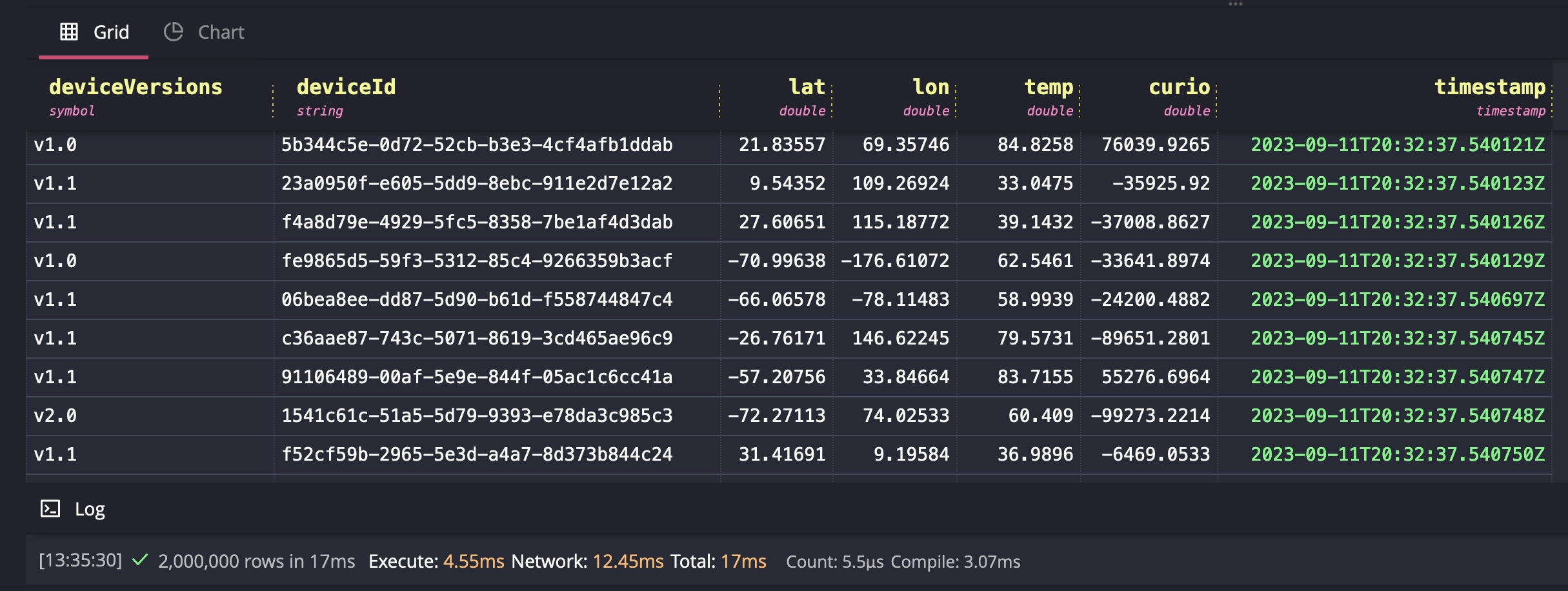
A broad SELECT query returns fast, even when Docker-ized. Just like that, we
have nice table view of all of our simulated devices.
Measuring database performance depends on many factors, like hardware, the schema, overall infrastructure and so on. However, we can still get a sense of how a specialized time-series database handles bursting data, even in a local case.
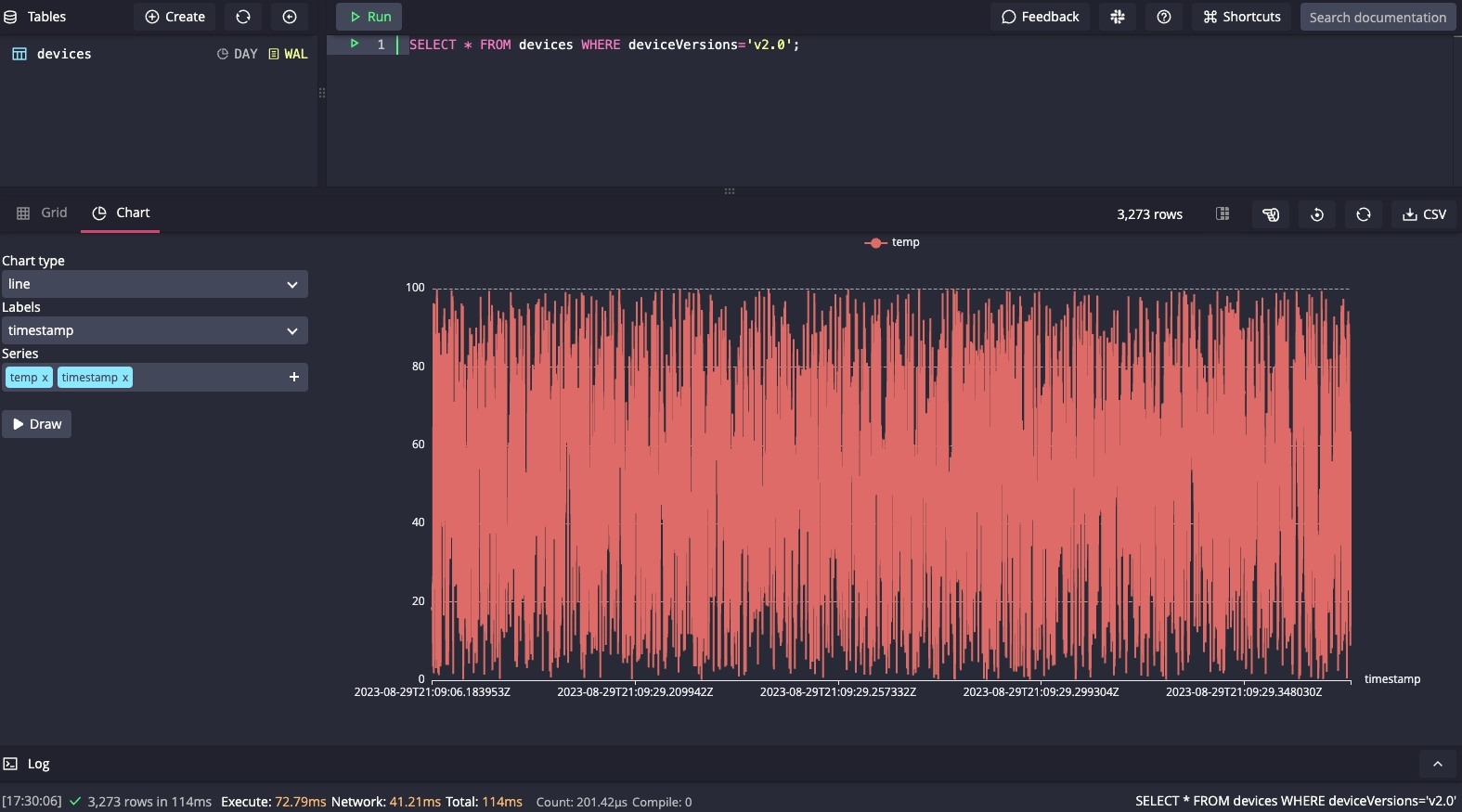
But speedy ingest is not all we're after. We also want to query and visualize
our data. Let's start with the built-in Chart view and see the temperature of
all devices with v2.0 over a period of time:

Connecting to Grafana
Instead of making charts directly within our database, we will offload visualization to a specialized layer for easier access. For this, we'll use Grafana.
Navigate to http://localhost:3000 and use the default
credentials to login: admin/admin. Remember, if you are creating something
in production, change the default user and password values!
In Grafana, select Data Sources under the Connections tab on the left hand panel and click the Add data source button. Navigate to the bottom of the page and click Find more data source plugins. Search for QuestDB and click Install.
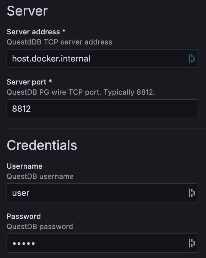
Once the QuestDB data source for Grafana is finished installing, click on the blue Add new data source button where the Install button used to be. Finally, configure it with the following settings:
Server address:questdb
Server port: 8812
Username:user
Password:quest
TLS/SSL mode:disable

Now that we have a data source, we can add visualizations. Click on the + symbol on the top right of the page and select New dashboard, then click on the blue + Add visualization button.

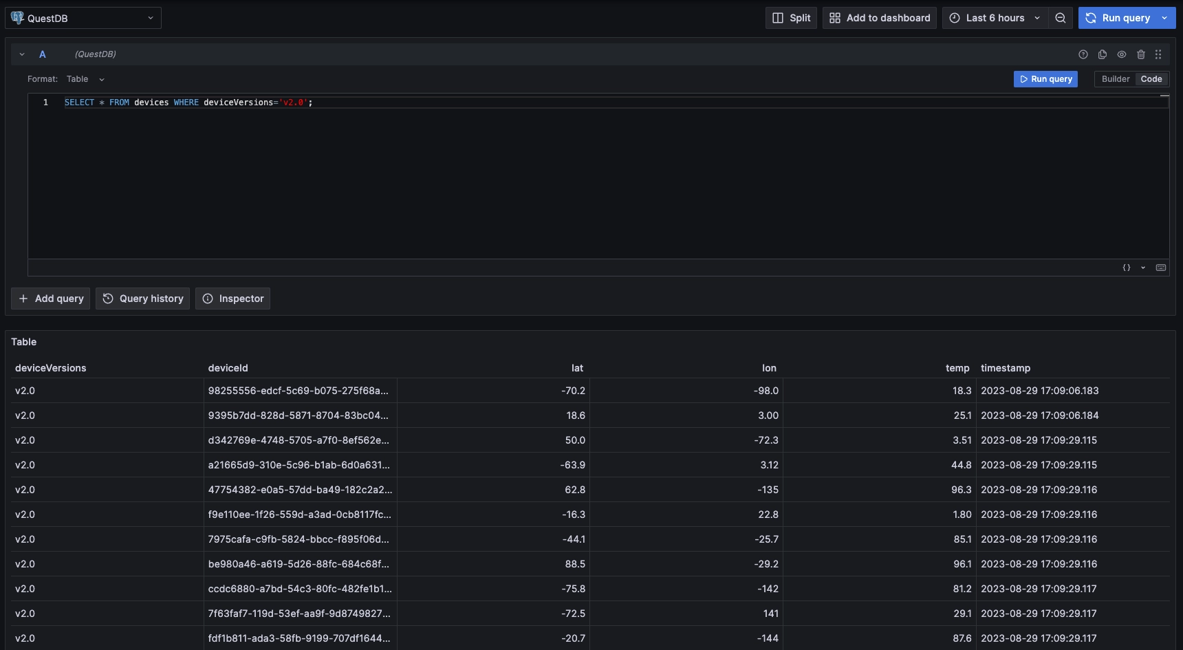
Use the native SQL query to visualize our dataset:

Now build out panels using built-in Grafana types. For example, we can use the time-series visualization, and add this query using the SQL Editor:
SELECT timestamp, temp FROM devices WHERE deviceVersions = 'v2.0'

From here, there are many ways we can alter the visual acuity to make the tracked values clear and easy to see.
Wrapping up
In this tutorial, we used a random IoT device data generator to show how to ingest bursting data into QuestDB. We then used Grafana to visualize the data. Underneath, we used the QuestDB Node.js Client library to utilize the InfluxDB Line Protocol for concise data transfer. Once the data hit QuestDB, we saw how fast it was to analyze them and also to create simple visualizations in the Web Console. Finally, we connected Grafana to the QuestDB PostgreSQL endpoint to build more complex panels.
In a real-world scenario, the data source may be coming directly from the devices, over a managed IoT connection service like AWS IoT Core, Azure IoT, or from a third-party. In that case, we can modify our simulator to listen to those events and use the same client library to send data. We may elect to also queue and batch our calls or use multiple threads to spread out the load. Whichever way we choose, using a specialized time series database like QuestDB prevents us from running into issues as burst and scale increases.