Mastering Grafana Map Markers and Geomaps
The Grafana Geomap panel is a powerful visualisation. With it, you can show both static and moving objects on a map in realtime. In this tutorial, we'll look at how to use Grafana maps with QuestDB, and share tips and tricks along the way.
Sample data
For this tutorial, we will apply this csv file full of Sydney, Australia bus data.
Start Grafana and QuestDB
Grafana provides an official QuestDB plugin.
To run through this tutorial, you'll need:
- Sample data (Check!)
- Running QuestDB
- Running Grafana instance
Need a hand?
Read our blog to get QuestDB and Grafana running with the official plugin.
Making map magic
Adding a Geomap panel
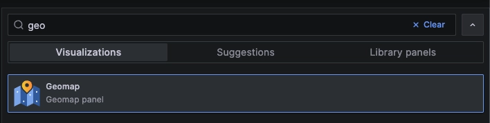
Click Add in your Grafana dashboard.
Then select Visualization.
From there, choose the Geomap panel.
Point the panel to your QuestDB data source:
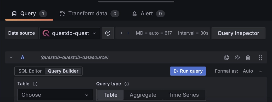
We can then add a query to start getting positional data. In this case, we'll
use the previously linked Sydney Bus dataset. We'll use the LATEST BY
statement which displays the last known datapoint for each individual bus:
buses LATEST BY plate;
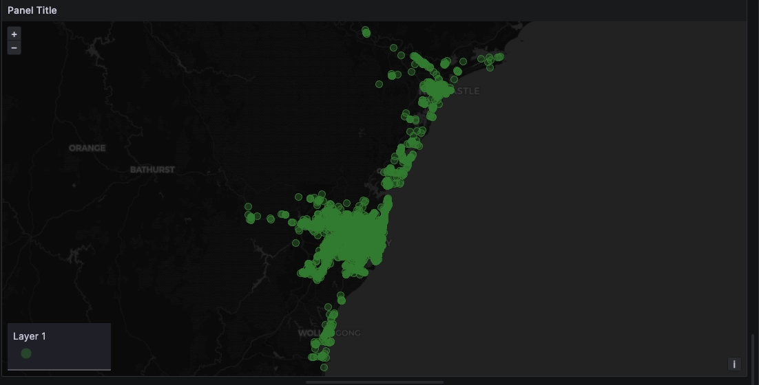
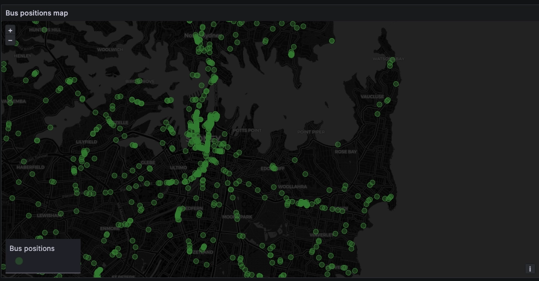
By default, this plots a map using a markers layer. Neat! However, the map is
not quite how we would like it. Since all the buses are in the New South Wales
area of Australia, we don't need to see the whole world:
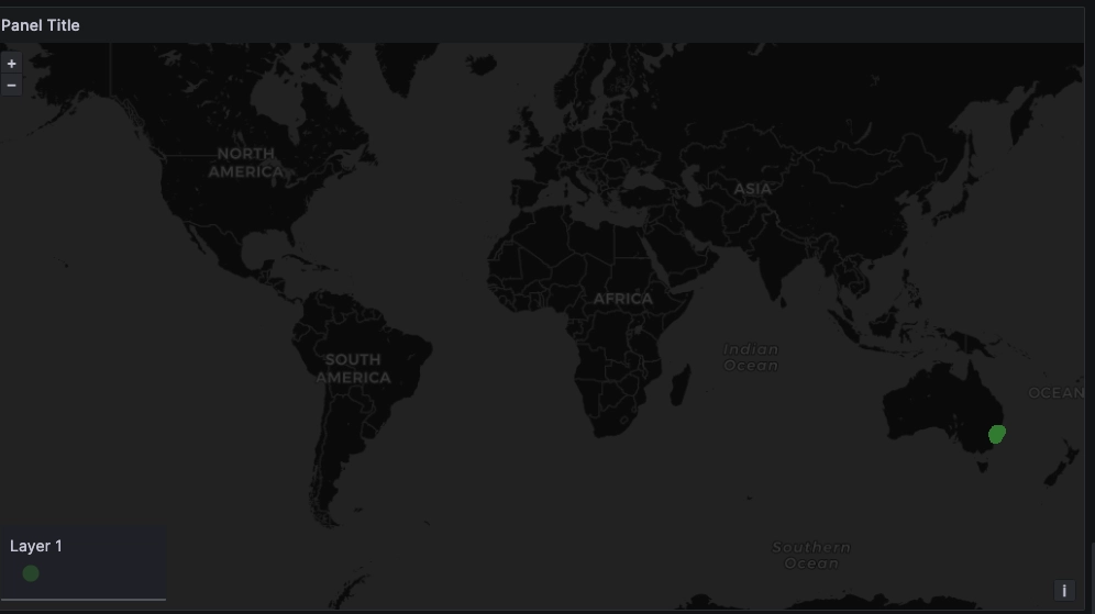
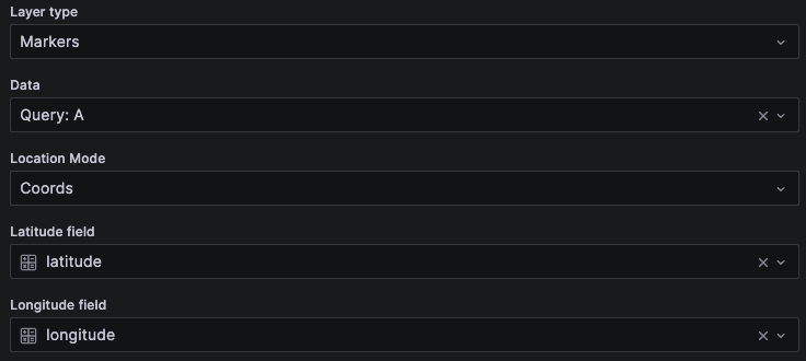
Why do we see all of Earth? Grafana automatically recognized the latitude and
longitude fields and displayed them as a result of Location Mode: Auto:
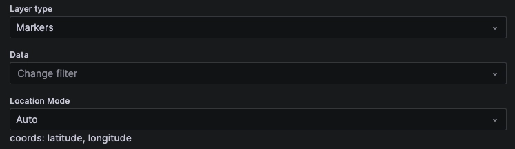
Depending on your dataset, you may need to select the Data query in the Data
field, or change the Location mode to manually set the coordinate fields,
Geohash or other to get the same results:
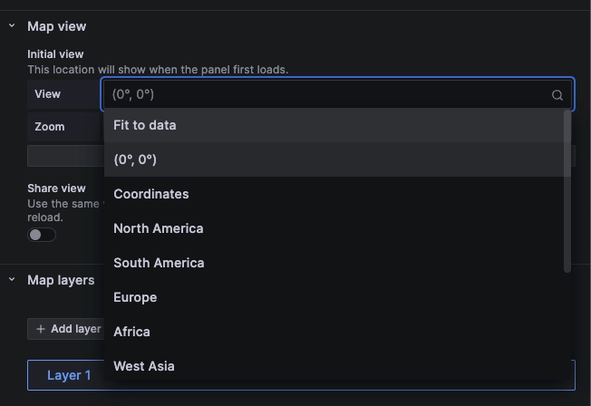
Fitting maps automatically
Thankfully, Grafana allows us to configure the map view so that it fits the area
of interest to the data. The Fit to data option is available under the
Map view setting under the view dropdown:
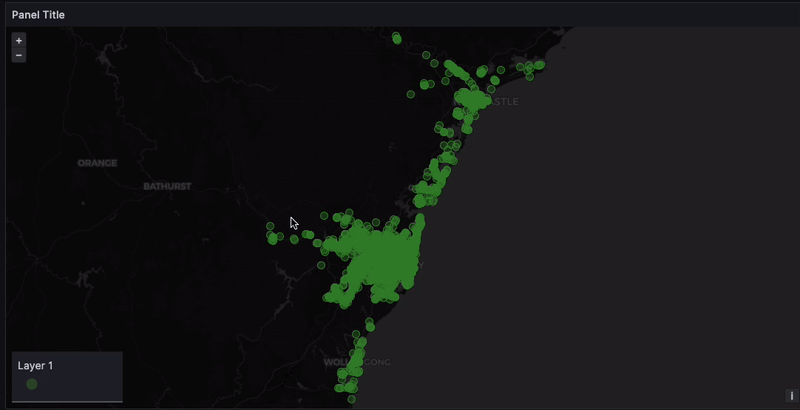
The resulting fit is more readable, and includes only Australia:
Fitting maps manually
Alternatively, adjust the view and save it to fit maps manually.
To do so:
- Zoom in and out of the map using the mouse wheel
- Pan across the map by clicking and dragging it around
Once you are satisfied with your view, click the Use current map settings
button. This will automatically set the View to Coordinates and save the
coordinates and zoom level corresponding to your view:
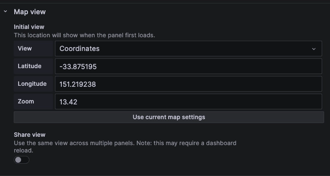
This method will ensure the map always loads the area of interest. However, do note that it does not act as a filter on the data. It may still load points outside the range which won't be displayed.
If performance is a consideration, for example if Grafana is overloaded by many points which don't end up being displayed, you may filter on coordinates in your original query.
Renaming layers
Let's rename our layers to be more friendly to the average dashboarder.
In the Map layers, find the layer in question.
To rename the map layer, click on the blue label, and select the name you wish:
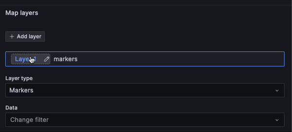
The resulting layer will now be correctly named on the map:
Making markers more expressive
The default markers may not always be adequate for the use case. For instance, your dataset may include other information such as heading, speed, traffic conditions, and so on. We can transform our markers to reflect this information on the map in a synthetic way.
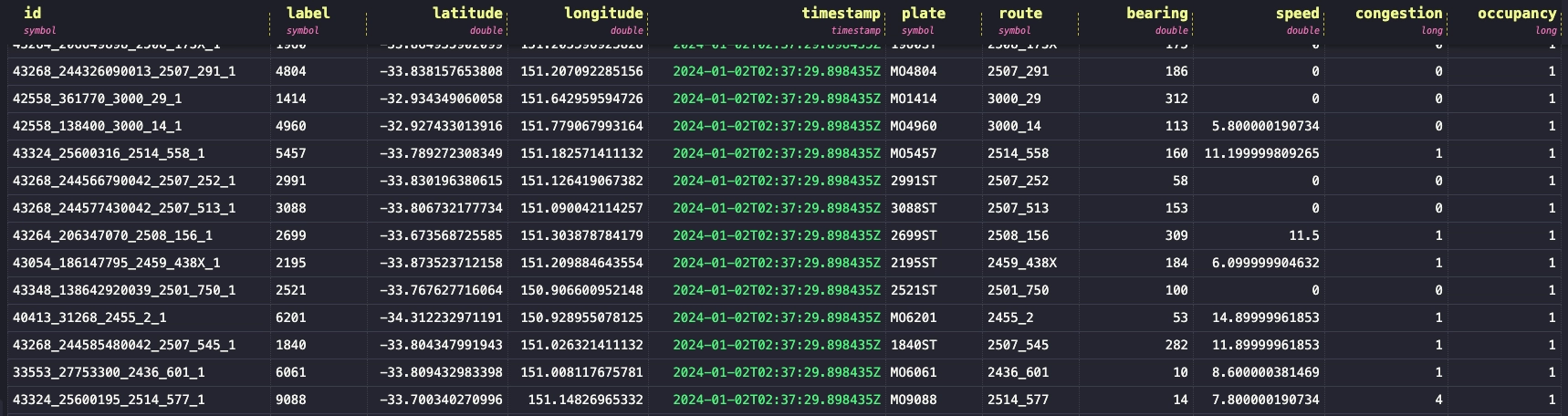
If we look at the result of our query, there is more data than the latitude
and longitude coordinates. You can see the underlying data either by using the
Grafana Query inspector and selecting the Data tab, or by running the query
in the QuestDB web console:
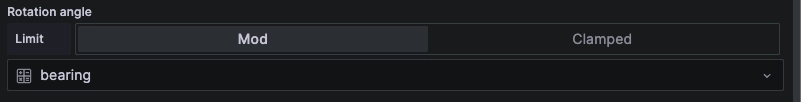
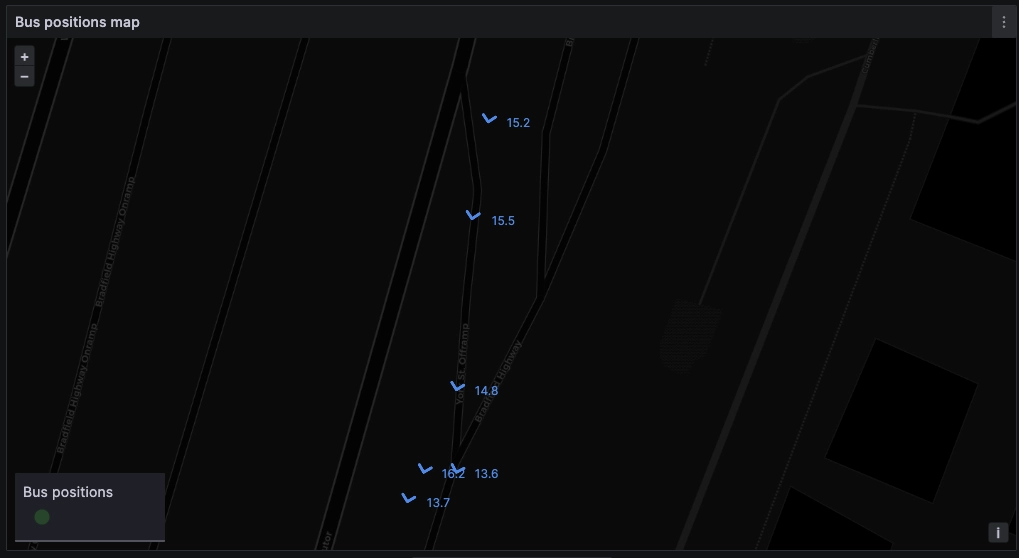
Indicate direction with marker rotation
We can use the bearing field to orient our map marker into the correct
direction. To do this, use the rotation angle property in the layer
configuration. By default, rotation is set to Fixed value, but we can use the
dropdown to select any appropriate field, which in this case is bearing:
However, since the default markers are circles, we would not be able to see the
bearing yet. Let's change the marker symbol property in the styles section
of the layer configuration. In this case, we'll use a pointing up chevron
icon:
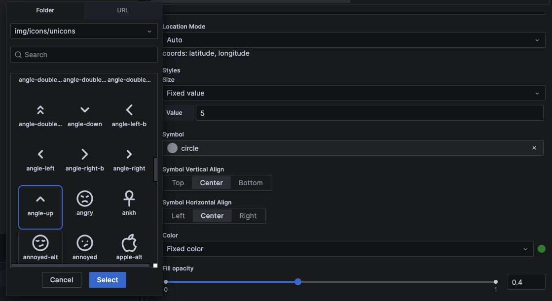
We'll do two things to our icon:
- Adjust the size to make them larger
- Increase the
fill opacityto 100% to make them more visible
And with that, we are now able to see the buses headings in addition to their current position:
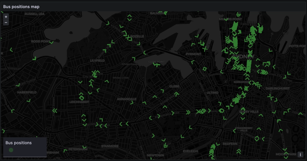
Indicate speed with marker color
We can further enrich this layer with colour to indicate another dimension, such
as speed. Similar to the rotation property, the Color property is set to
fixed color by default.
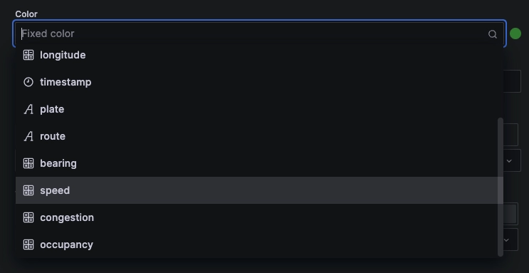
We can change this color to scale according to one of our dimensions. Let's set
the speed dimension by selecting it from the dropdown:
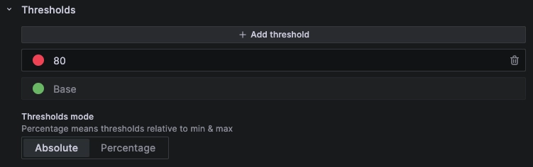
By default, the colors would not be very meaningful because they are based on
the set thresholds which are <80 (denominated as base) and >80. Since no
bus is going above 80Mph, all are displayed as the base color (green):

To display this information in a more meaningful way, we can either change the color scheme to follow a gradient…

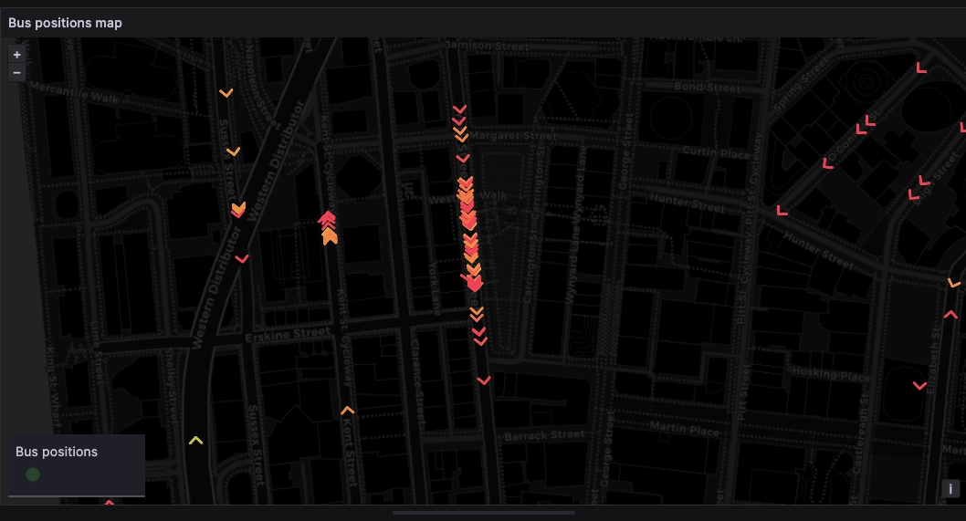
… Or alternatively set our own thresholds:
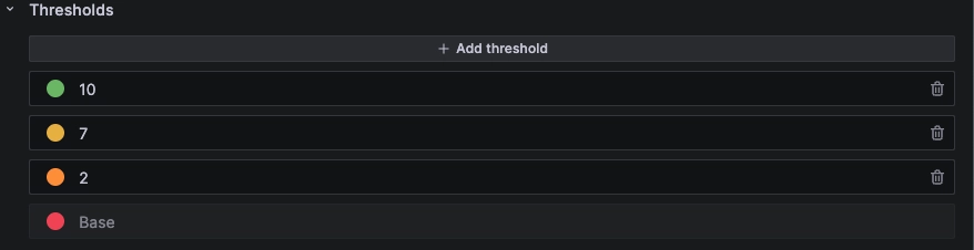
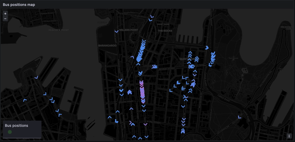
In this case, buses going less than 2Mph are red (likely buses at a stop, or in traffic). Buses going above 10Mph are colored green:
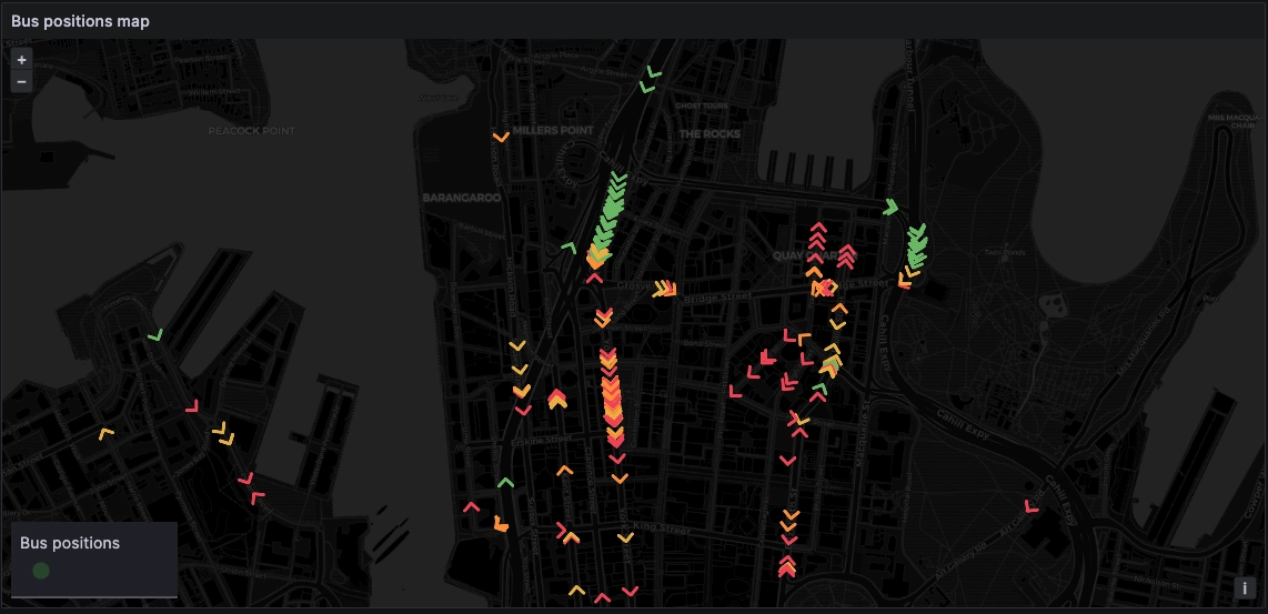
Another dimension can provide more color to the markers. What if we set the reported level of traffic, or the reported level of occupancy? For example, in the below, the purple buses are reporting higher congestion levels, which is consistent with the speeds above:
Adding map labels
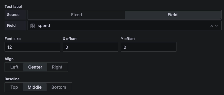
We can further augment the map by adding labels next to the markers using any of
our query result fields. To do this, head to the Text label section of the
layer configuration. You can either use a fixed label by typing it in the
value field, or set source to field to use a query result field:
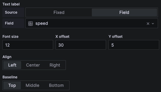
Note that by default, the label will be centred on top of our marker which may make it hard to read…
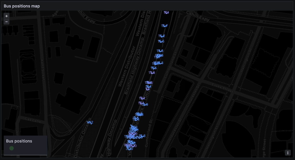
From here, we can use the X offset and Y offset properties to separate the
label from the marker:
Plotting trails and routes
Let's take a step back.
It's wild to think that our initial query was this simple:
buses LATEST BY plate;
This query only displays the latest position for each bus.
However, we can expand this query to display a short positional history. We can
change the layer type from markers to route (which is marked as a Grafana
beta feature currently) to plot historical positions:
SELECT * FROM buses WHERE $__timeFilter(timestamp)
Lots of potential!
But, err... if we plot all the routes in one go, we'd end up with this…
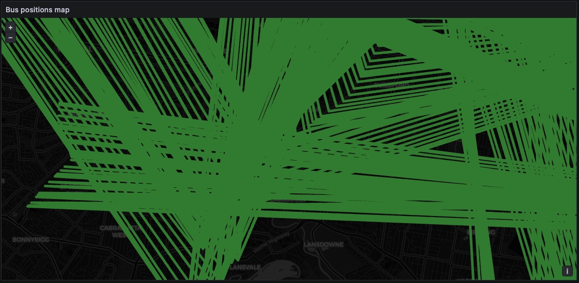
Currently Grafana is not able to separate the routes, even when we use
transformations to separate the data such as the partition by values
transformation. Instead, it treats all locations as a single series and plots
between them resulting in an endless zigzag. It's a trip.
This is a current Grafana limitation which others have reported before us, and it's reasonable to hope that it will be lifted in an upcoming release.
So what can we do?
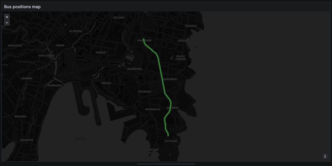
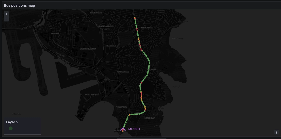
To plot routes, we need to limit each layer to a single path.
For example by filtering on the bus plate:
SELECT * FROM busesWHERE $__timeFilter(timestamp) AND plate = 'MO1691'
The result looks more like what we expect:
We can then adjust the settings like we did for the markers to enrich the map
with more detail such as colouring by speed, and using Arrows: forward to
indicate historical direction.
We could even create a second layer with the latest position as a marker to
display the current position (purple marker) along with the trailing route over
the last 15 minutes:
Going further: plotting multiple routes
Given the aforementioned Grafana limitation, we would need to create as many
separate charts as there are individual buses. Doing this is easy by
transforming the query to use
Grafana variables, and using
the repeat by panel option.
This will automatically repeat the above chart for all plates and achieve the desired outcome:
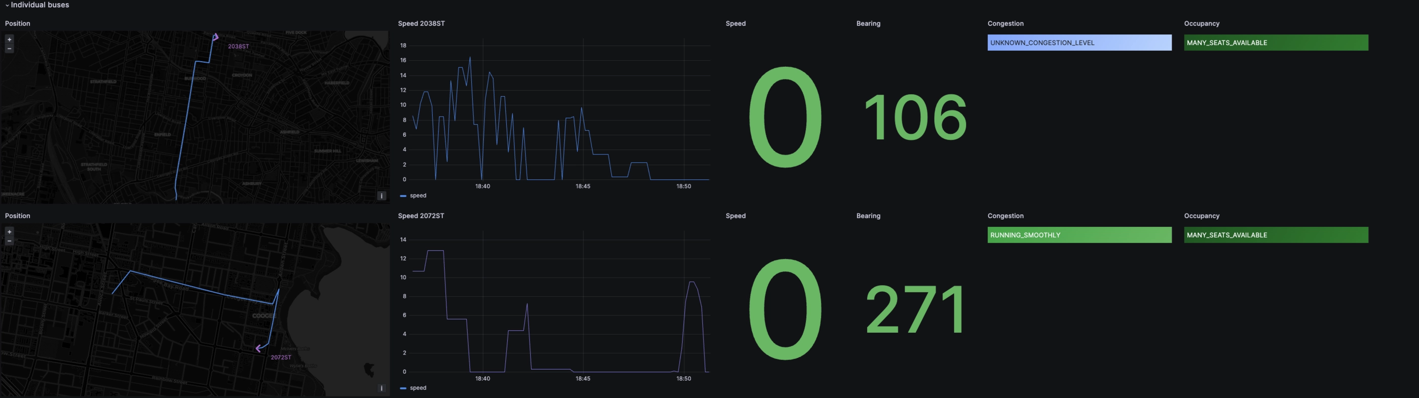
Hopefully, Grafana will soon release an update so that multiple routes can be plotted in an individual panel, making this map element even more powerful at synthesising geospatial data!
Thanks for reading.
Interested in more Grafana tutorials?
Check these out:
- Fluid real-time dashboards with QuestDB and Grafana
- Build your own resource monitor
- Tracking sea faring ships with AIS data and Grafana
- Discovering stories in French real estate data
- Visualizing real-time NYC cab data and geodata
- Increase Grafana refresh rate frequency
- Or checkout our Grafana blog tag