There are many open tools that allow system administrators to monitor resource utilisation such as CPU, memory, disk, and network. While most of these tools only display the data in an interface, few offer to store the data and make it available to query - or visualize - at a later date.
In this tutorial we'll build a small resource monitor to do just that:
- Polls a system for resource usage
- Saves the output in a QuestDB instance
- Display the output Grafana in realtime
We'll also see how we can use the resulting time series to correlate with other events such as running a particular bit of code. By the end, you'll have a solid template that deepens your understand of both resource monitoring and analysis and the code/resource relationship.
Setup
To reproduce examples in this tutorial, you need
- A running instance of QuestDB
- Not running yet? Checkout the quick start.
- A running instance of Grafana
- We've got a small guide to help
- Sample data. In this case, we'll use
psutilto generate data about local ressource usage (CPU, Ram) within a Python script.
Generate data with psutil
In this article, we'll use Python.
It's clear and readable, and the basics apply to many other languages.
The psutil library will raise information about local resource usage.
It performs a variety of functions to get resource information, including looking at and even managing system related process.. We can put its features into two main buckets: (1) system monitoring and (2) process management:
-
System monitoring:
- Monitor resource utilization like CPU, memory, disks, network, sensors and so on
- Retrieve system uptime and boot time
- Access information about system users, battery status, and disk partitions
-
Process management:
- System process infomoration, such as their ID, name, status & CPU/memory usage
- Control processes; terminate or kill them
- List active processes or search for specific ones
The utility will generate data for us.
We'll start with CPU and RAM - the basics.
Ingest resource data into QuestDB
We can then ingest the data using the QuestDB Python client as follows:
import psutil
from questdb.ingress import Sender, TimestampNanos

def sendCPUinformation(sender, cpu, ts):
    i = 0
    for core in cpu:
        sender.row(
            'cpu',
            symbols={'id': str(i)},
            columns={'pct': core},
            at=ts)
        i += 1

def sendRAMinformation(sender, ram, ts):
    sender.row(
        'ram',
        symbols={},
        columns={'pct': ram[2],
                 'gb': ram[3] / 1000000000},
        at=ts)

with Sender('localhost', 9000) as sender:
    while True:
        cpu = psutil.cpu_percent(0.5,percpu=True)
        ram = psutil.virtual_memory()
        ts = TimestampNanos.now()
        sendCPUinformation(sender, cpu, ts)
        sendRAMinformation(sender, ram, ts)
        sender.flush()
Show multiple symbols
In the above example, we made a design decision to treat all CPU readings as one
series with an associated symbol column to identify the individual CPUs. An
advantage of this approach is that to show all individual CPUs, we don't need to
manually type something verbose like select CPU1, CPU2, … from in our SQL
queries.
Instead, we can go with something like the following:
SELECT
  timestamp,
  id,
  pct
FROM CPU
WHERE $__timeFilter(timestamp)
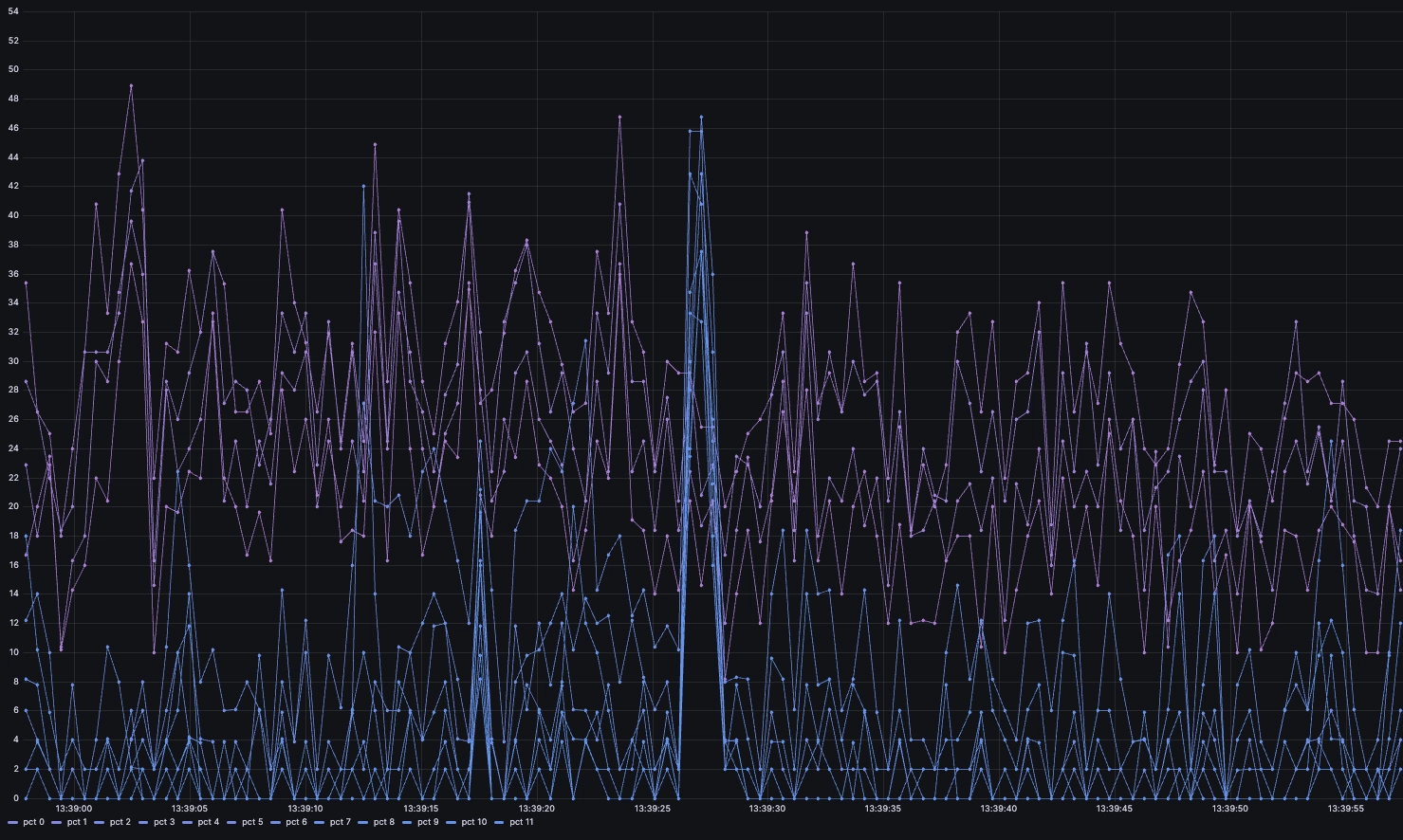
However, when plotting in Grafana, we get something like this:
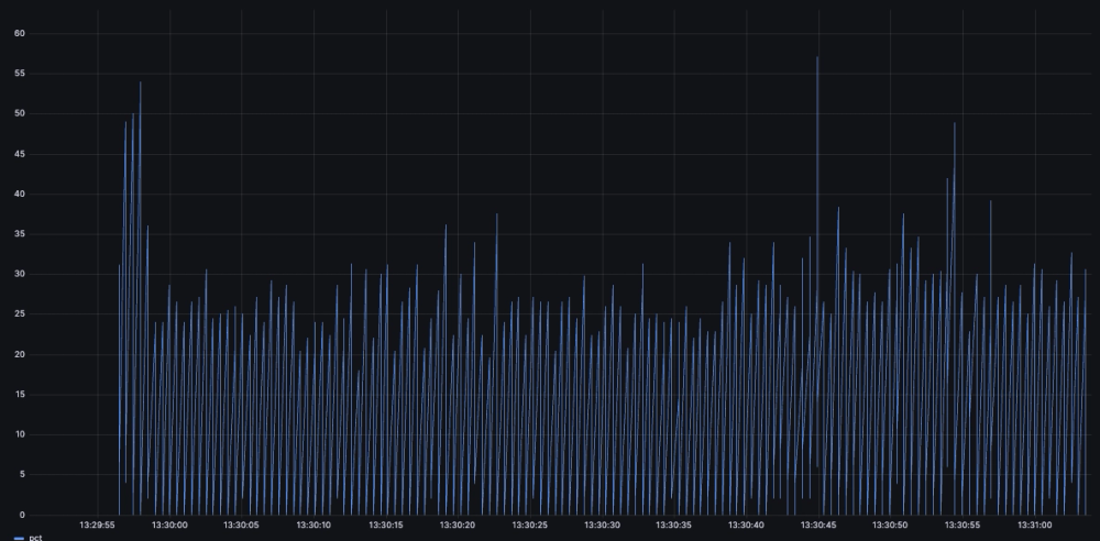
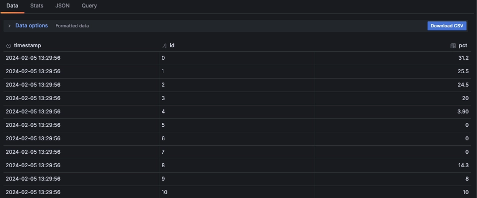
In this very spiky view, we do not see the full granularity we would if we segregated by each core. Even if this is indeed in the data. To prove that it is, we can see the data returned by the query in the Grafana inspector:
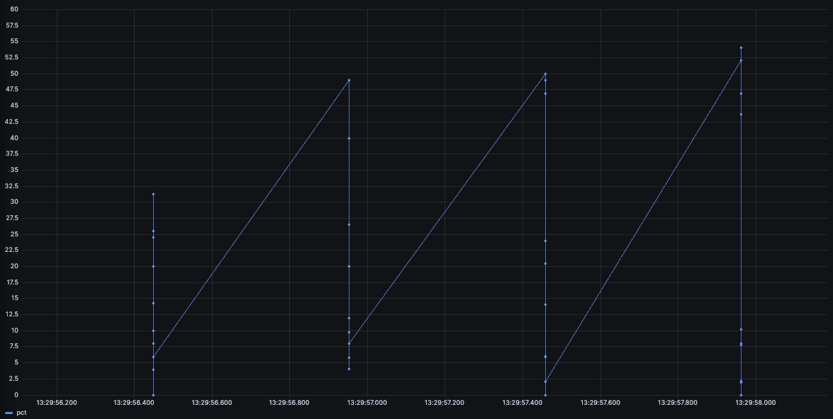
So what we are shown is in reality the succession of all the CPU readings as if they were the same series. We can see what's going on more clearly by zooming in on the chart:
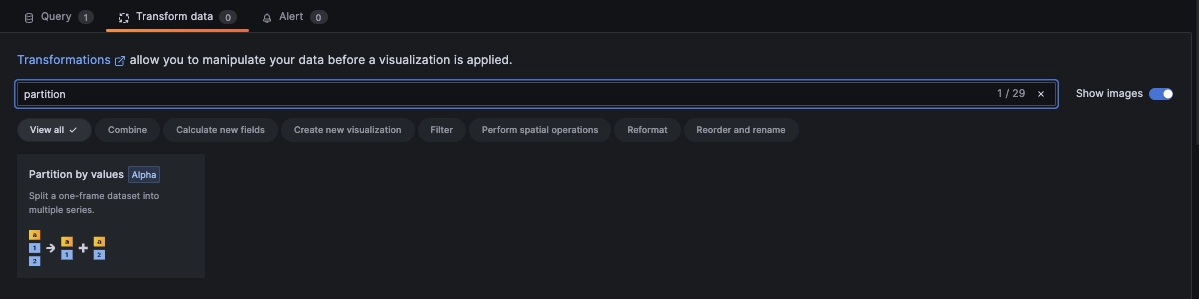
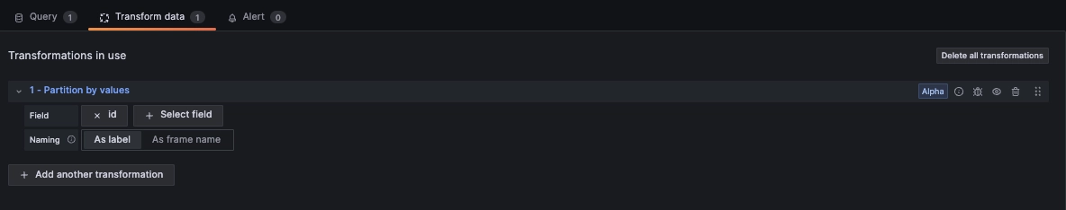
Grafana requires us to 'tell' it that the series are in fact different using the
partition by values transformation. We can access it by selecting the
Transform data tab above the query editor:
The setup is rather simple.
We point the field at our partitioning symbol, in this case the cpu id:
As a result, we can now see our individual series instead of a composite:
Improving readability
Our little resource monitor collects a lot of data.
Perhaps a bit too much for this chart to be readable!
One way we could make this more legible is to use moving averages through window functions such as the following:
SELECT
  timestamp,
  id,
  avg(pct) OVER (
    PARTITION BY id
    ORDER BY timestamp
    RANGE BETWEEN 30 SECONDS PRECEDING AND CURRENT ROW
  )
FROM CPU
WHERE $__timeFilter(timestamp)
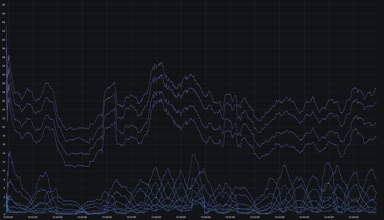
While this is definitely less noisy, the moving average is a lagging indicator
that tends to smoothen values over time. Fortunately, our partition by values
transformation translates well into other chart types. With it, we can create
multiple panels in one go.
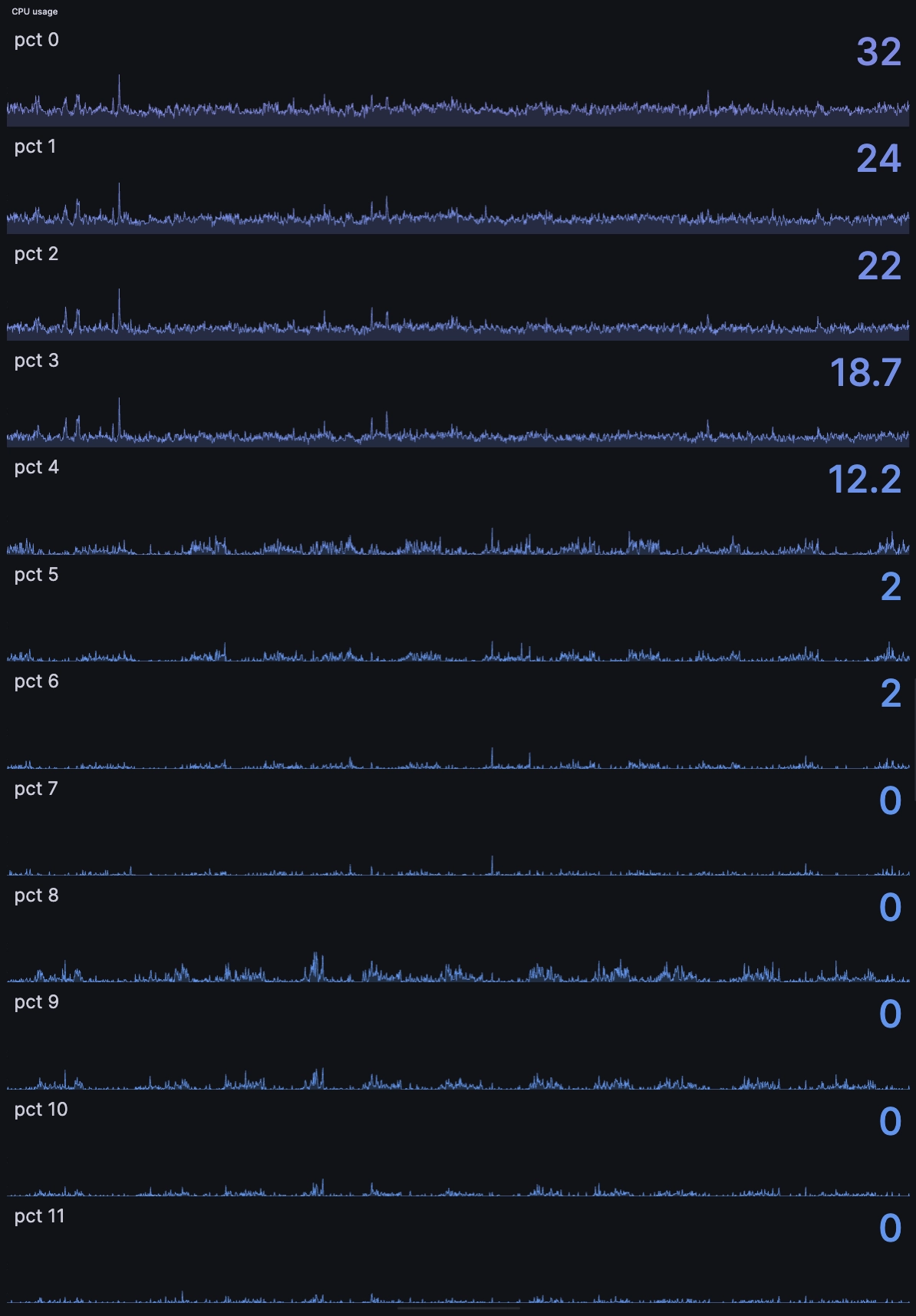
We change the chart type from time series to Stat...
And end up with the following:
Expanding scope with psutil
So far we only looked at cpu usage. But psutil has loads more utilities. For example, as we described earlier, it can monitor IO, network, disk, battery, fans, temperatures, and more.
Let's look at an expanded case, with some sample charts:
import psutil
from questdb.ingress import Sender, TimestampNanos

def sendCPUinformation(sender, cpu, ts):
    i = 0
    for core in cpu:
        sender.row(
            'cpu',
            symbols={'id': str(i)},
            columns={'pct': core},
            at=ts)
        i += 1

def sendRAMinformation(sender, ram, ts):
    sender.row(
        'ram',
        symbols={},
        columns={'pct': ram[2],
                 'gb': ram[3] / 1000000000},
        at=ts)

def sendCPUtimeInformation(sender, data, ts):
    i=0
    for core in data:
        sender.row(
            'cpu_time',
            symbols={'id': str(i)},
            columns={'idle': core.idle,
                 'user': core.user,
                 'system': core.system,
                 'nice': core.nice
                 },
            at=ts)
        i+=1

def sendBatteryInformation(sender, data, ts):
    sender.row(
        'battery',
        symbols={},
        columns={'percent': data.percent,
                 'plugged': 1 if data.power_plugged else 0},
        at=ts
    )

def sendSwapInformation(sender, data, ts):
    sender.row(
        'swap',
        symbols={},
        columns={'total': data.total,
                 'used': data.used,
                 'free': data.free,
                 'pct': data.percent},
        at=ts
    )

with Sender('localhost', 9000) as sender:
    while True:
        cpu = psutil.cpu_percent(0.5,percpu=True)
        ram = psutil.virtual_memory()
        ts = TimestampNanos.now()
        cpu_time = psutil.cpu_times_percent(0.5,percpu=True)
        battery = psutil.sensors_battery()
        swap = psutil.swap_memory()

        sendCPUinformation(sender,cpu,ts)
        sendRAMinformation(sender,ram,ts)
        sendCPUtimeInformation(sender,cpu_time,ts)
        sendBatteryInformation(sender,battery,ts)
        sendSwapInformation(sender,swap,ts)

        sender.flush()
All graphed up, it looks like this:
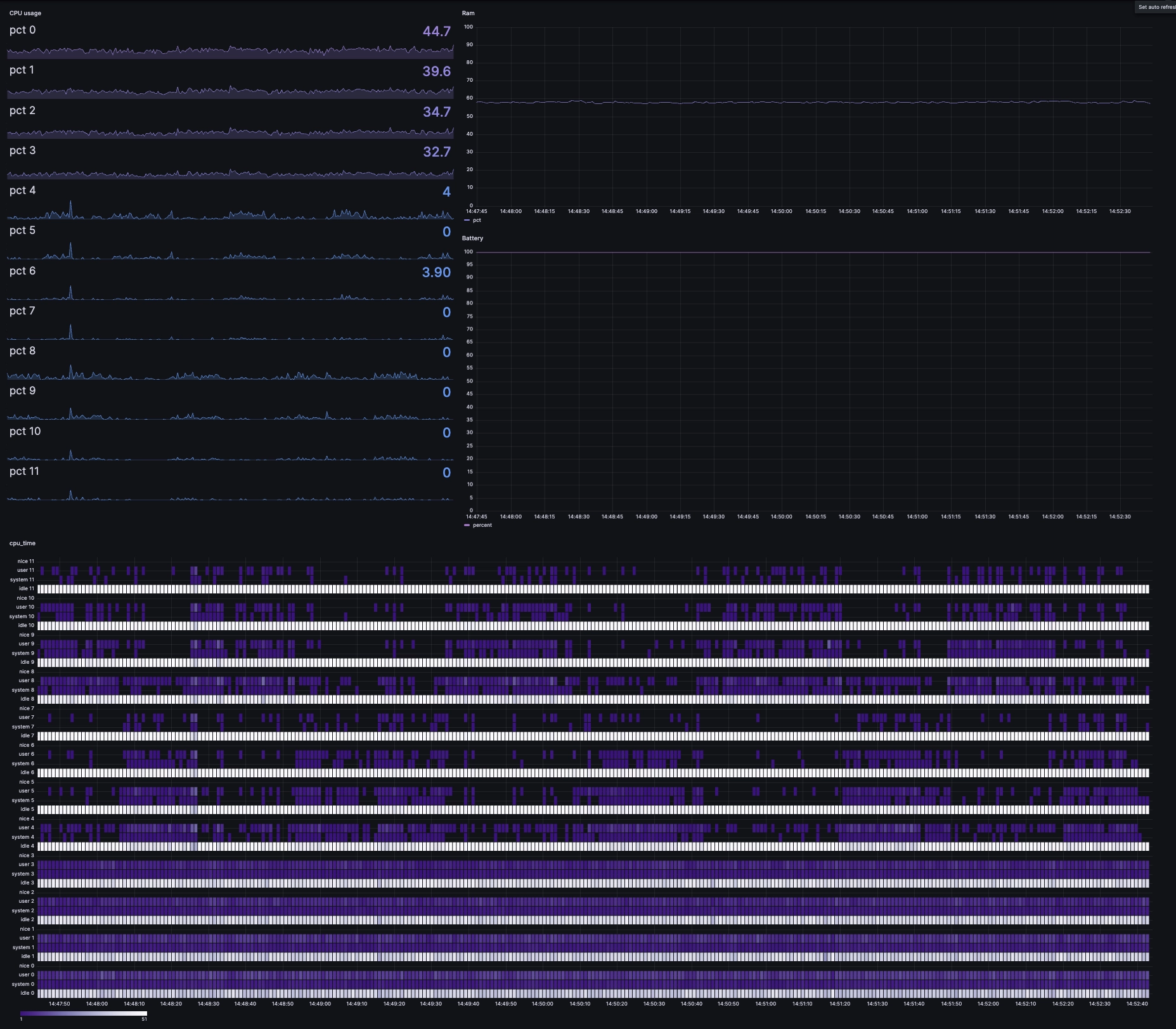
Fancy! It would look natural in any network operation centre!
What's happening in the code?
We've added some extra goodies to CPU and memory:
- sendCPUtimeInformation: Deeper CPU time statistics - idle, user, system, nice - per core.
- sendBatteryInformation: Battery status, percentage and charging status.
- sendSwapInformation: Collects swap memory statistics - total, used, free, percent.
Correlating events and resources
We have resources. And our application - whatever it is - will have events.
Say, for example, this generic event:
def log_event(sender, event_name, ts):
    sender.row(
        'events',
        symbols={'event': event_name},
        columns={'timestamp': ts},
        at=ts
    )

with Sender('localhost', 9000) as sender:
    ts = TimestampNanos.now()
    log_event(sender, 'application_start', ts)
    sender.flush()
Now, our little logging function can take context from anywhere in the application space. With it, we can then assemble our resource data and our event data and correlate them with a SQL query:
SELECT
  cpu.timestamp,
  cpu.id,
  cpu.pct,
  events.event
FROM cpu
LEFT JOIN events ON cpu.timestamp = events.timestamp
WHERE cpu.timestamp BETWEEN '2024-05-01' AND '2024-05-02'
AND $__timeFilter(cpu.timestamp)
This LEFT JOIN looks for a time-range to look for CPU usage as it relates to
specific events. Maybe the really_really_big_parse event is bogging your
system down. Or perhaps it's little_seemingly_unimportant_event.
Summary
This article lays the foundation for resource monitoring and event tracking. It then using this foundation to correlate these two aspects. With QuestDB under-the-hood, such a monitoring system can scale to great heights. Powerful SQL queries enable deep analysis and Grafana visualizations.
What kind of application-monitoring dashboards will you create?
Show us on Twitter!
Interested in more Grafana tutorials?
Check these out:
- Working with Grafana Map Markers
- Fluid real-time dashboards with QuestDB and Grafana
- Build your own resource monitor
- Tracking sea faring ships with AIS data and Grafana
- Visualizing real-time NYC cab data and geodata
- Increase Grafana refresh rate frequency
- Or checkout our Grafana blog tag