Tracking financial assets can be tricky. Emerging crytocurrency markets present a perfect field to battle test some tried-and-true analysis methods. To that tune, we'll look at "correlation" and "pair trading".
For example, consider whether the pair of Bitcoin (BTC) and Ethereum (ETH) are correlated, and whether their correlation is a valuable signal. Are they becoming more or less correlated? Why? We can dig into that, and more, and we can do it all through slick, easy to follow charts.
In this article, we'll investigate the correlation between BTC and ETH through a correlation scatter chart, presented in Grafana using QuestDB. If you wish to follow along, check out our tutorial for setup instructions or visit the Grafana docs.
Why correlation matters in trading?
First, let's answer why correlations matter.
There are many reasons, and we'll pick three.
1. Diversification
Anyone involved in finance has heard the following at some point: "Don't put all your eggs in the same basket!", "Diversify your risk". These helpful adages all speak towards portfolio diversification.
The idea of diversification is that the volatility, and therefore the risk, of the portfolio is reduced overall when it is spread out among a greater number of assets. If you have many small and varied bets and a few of them go wrong, it does not affect your bottom line as much as if you missed on a handful of big, related bets.
Correlating assets also helps to see whether you are diversifying as much as you intend. It may be the case that your diversification strategy blends together two strongly correlated assets. In that case, you'd be wise to... diversify better.
2. Hedging your bets
Correlations can help indicate assets that make strong hedges. For example, if you are exposed to a US bank and the market is closed, you can trade a US banks ETF in Europe as a temporary hedge. Correlation is what relates the two into one cohesive plan.
3. Market opportunities
Correlations indicate trading opportunities. If two assets are correlated, then a transient de-correlation could be the sign of an upcoming convergence. For example, if Coca Cola goes up 1% and Pepsi goes down 1%, maybe there is an opportunity to sell Coca Cola and buy Pepsi hoping that the price variations will converge towards one another. This is the principle behind pairs trading.
Building a correlation scatter chart
The trades dataset contains historical prices for pairs of crypto currency.
The specific pair that we will evaluate is ETH-USD and BTC-USD. That is the
price of Ethereum and Bitcoin, respectively, shown in US Dollars. We'll use this
data to visualize the relative returns on an x,y scatter plot.
This dataset can be pulled into QuestDB from the Cloud UI or in seen our live demo instance.
Calculating the returns be done as follows:
WITH
pairOne as (SELECT timestamp, symbol, last(price)/first(price)-1 p1 from trades where symbol = '$Pair' and  timestamp > dateadd('d', -$interval1, now()) SAMPLE BY $SampleSize),
pairTwo as (SELECT timestamp, symbol, last(price)/first(price)-1 p2 from trades where symbol = $Pair2 and  timestamp > dateadd('d', -$interval1, now()) SAMPLE BY $SampleSize)
SELECT p1,p2 from pairOne asof join pairTwo
Note that in this case we used a few Grafana variables…
$Pairis the pair we want to plot all correlations against$Pair2is a list of pairs which will be used to repeat the individual plots$SampleSizeis the interval calculation of returns; 10-minutely returns, daily returns and so on$interval1and$interval2are both intervals in days. This is to visualise correlations over two different time frames, for example to get a sense of whether it increased or decreased recently.
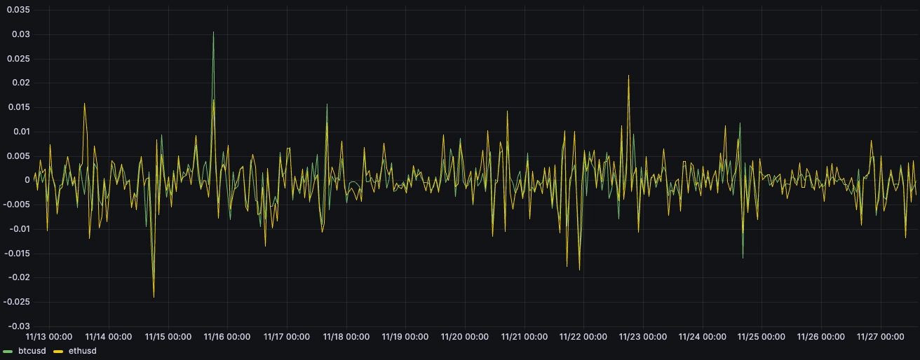
If we were to plot these returns over time, we'd end up with a chart like this:
WITH
pairOne as (SELECT timestamp, symbol, last(price)/first(price)-1 p1 from trades where symbol = 'BTC-USD' and  timestamp > dateadd('d', -15, now()) SAMPLE BY 1h),
pairTwo as (SELECT timestamp tp, symbol, last(price)/first(price)-1 p2 from trades where symbol = 'ETH-USD' and  timestamp > dateadd('d', -15, now()) SAMPLE BY 1h)
SELECT timestamp, p1 btcusd, p2 ethusd from pairOne asof join pairTwo
Both lines show the hourly returns of both ETH-USD and BTC-USD against the
USD. From a cursory inspection, they 'look like' they are rather correlated. The
typical way of plotting this on a chart is to use a scatter where each
observation - in this case each point on the time axis - is a point, and the
coordinates of the point are (ETH-USD,BTC-USD).
In Grafana:
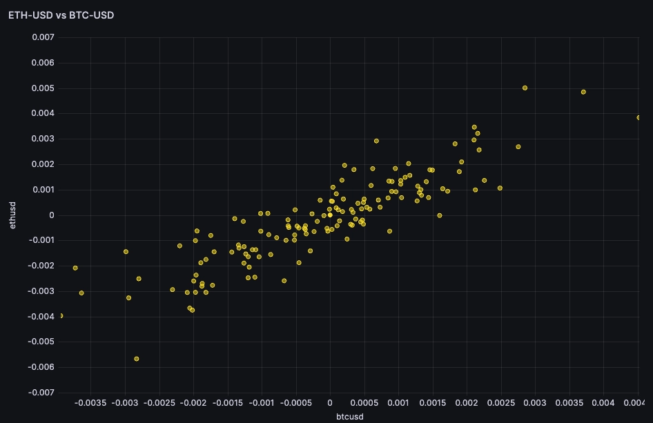
If the hourly returns of ETH-USD and BTC-USD are perfectly correlated, then
for every percentage change in ETH-USD there would be an equivalent percentage
change in BTC-USD. This would result in a scatter plot where the points form a
straight line that could be described by the equation y = x, where y
represents the return of BTC-USD and x represents the return of ETH-USD.
From a visual inspection, y = x would be a 'roughly' good regression. It would
suggest that BTC-USD and ETH-USD are directly correlated, and that the
correlation is strong.
Calculating correlations
Thanks to
charlespnh's contribution, the
corr() function allows us to calculate the correlation over time. We can
examine it on an hourly basis:
WITH
BTCUSD as (select timestamp, price from trades where $__timeFilter(timestamp) and symbol = 'BTC-USD' ),
ETHUSD as (select timestamp, price from trades where $__timeFilter(timestamp) and symbol = 'ETH-USD' )
SELECT BTCUSD.timestamp, corr(BTCUSD.price,ETHUSD.price) from BTCUSD asof join ETHUSD sample by 1h
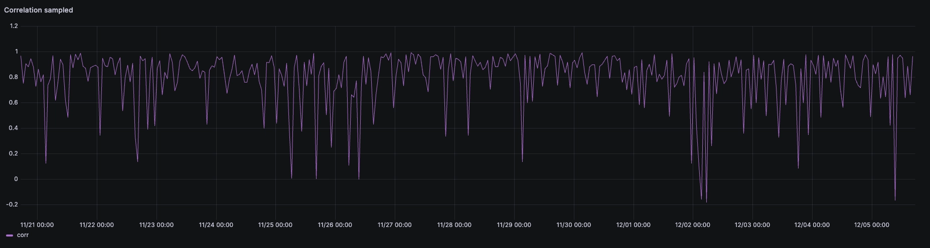
Rolling correlations
It seems that there are two states, one where both pairs move in tandem, and another where they move for idiosyncratic reasons. Zooming out, we can expand to a wider time horizon. From there, we can use the moving average function to look at the rolling correlation over the rolling past week, for the whole of 2023.
We can run the query both for 7 days and for 30 days:
WITH data as (
  WITH
  BTCUSD as (select timestamp, price from trades where $__timeFilter(timestamp) and symbol = 'BTC-USD' ),
  ETHUSD as (select timestamp, price from trades where $__timeFilter(timestamp) and symbol = 'ETH-USD' )
  SELECT BTCUSD.timestamp, corr(BTCUSD.price,ETHUSD.price) from BTCUSD asof join ETHUSD sample by 6h)
SELECT timestamp, avg(corr) over(ORDER BY timestamp range between 7 DAY preceding and current row) from data
The result suggests that the correlation of both pairs has been going down over 2023 from around 0.85-0.9 at the beginning of the year to ~0.75 at the end of the year:
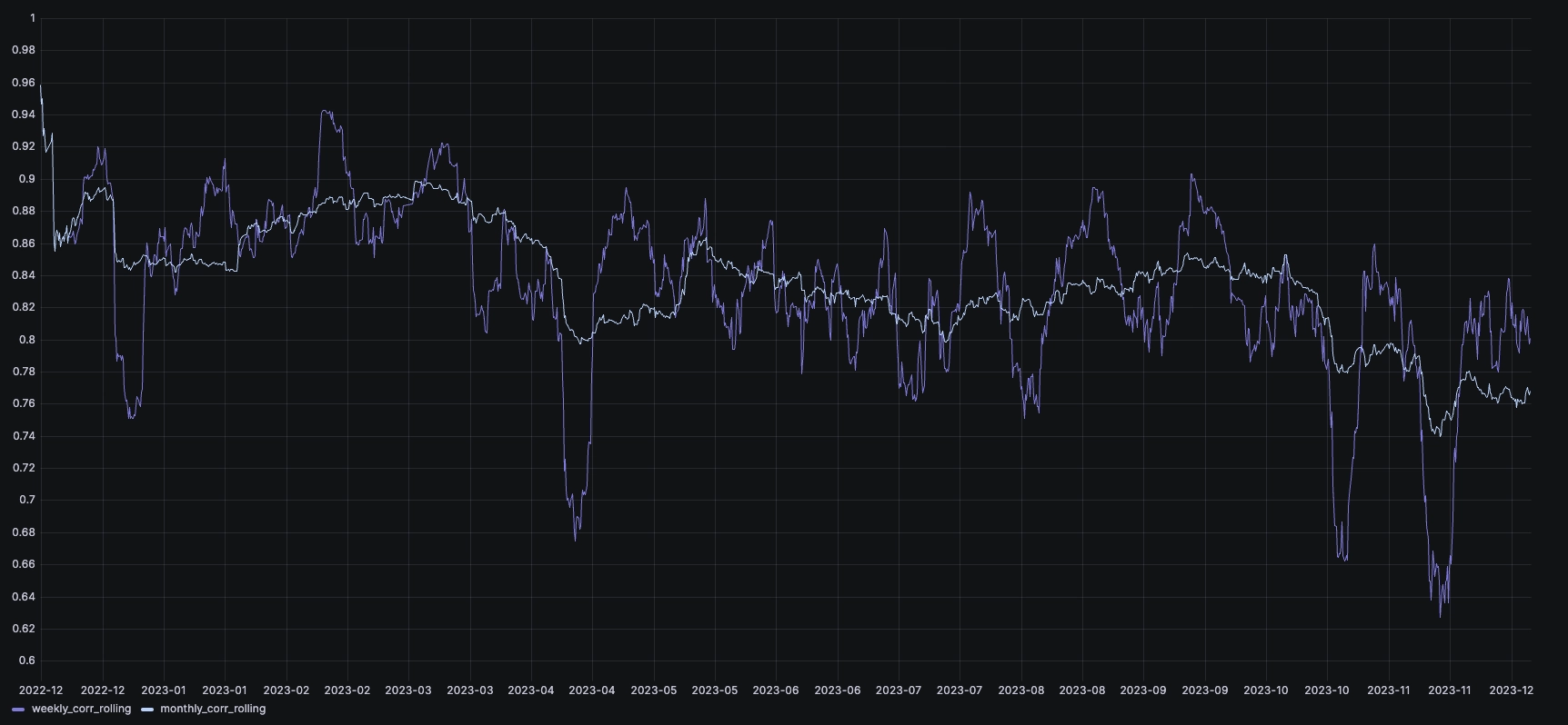
The inflection point was around Q3 2023. If we look at the performance of both, normalized as the 1st of September, we can see that in the last 2 months, BTC has significantly outperformed ETH:
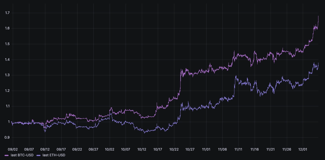
This is likely a result of the anticipated approval of physically-backed bitcoin ETFs in the US. We look forward to observing what this will bring to the market!
Summary
This article highlights correlations in financial trading. They're very useful!
Especially when looking at emerging cryptocurrencies like ETH-USD and
BTC-USD. Our analysis revealed trends and shifts in asset relationships over
time, emphasizing the importance of this approach in a dynamic market
environment. In particular, we discovered that BTC-USD and ETH-USD are
losing their correlation since this year. Will it continue?
We're excited to see what sort of trends our community can find. QuestDB and its best-in-class ingestion performance is a strong fit for financial data. If you work with market data, consider giving it a try.