The default view on most trading platforms is a trading instrument view. You will have one view for BTC-USD, one for ETH-BTC, one for BTC-USDT, one for BTC-USDC and so on. They are treated as different entities on the front-end but in reality… It's all connected!

Typically, you would be presented with a page per pair with order books, charts, and trade history, in addition to your own blotter. This can be difficult to make sense of. It can be challenging to connect related pairs together or to get a broad sense of what's happening overall.
Making a custom view
If you are a maker, then you may be tempted -- like the folks at QuestDB -- to build your own tools. Most exchanges allow live market data to be pulled via an API connection. We already showed how to build something similar with the Coinbase API, and we can use the same principles to build our own aggregated trade blotter to improve our view of the markets overall.
While building your own platform requires initial time and effort, depending on how you trade, it can be very valuable in the long run. It makes it infinitely easier to build custom tools to help you trade more efficiently or to simply increase your market awareness. As before, we'll combine the high performance ingest and query capabilities of QuestDB with the custom chart wizardry of Grafana. If you need a refresher on how to connect the two, check out our tutorial or visit the Grafana docs.
Trade watch
The first block to build is typically an aggregated trade watch. Instead of seeing trades in separate windows, the idea is to bring them all into one single place. If we combine this with Grafana's higher refresh rate, we can see trades as they happen in realtime across all pairs into a unified feed. Of course, you can apply this both to monitor market trading activity and to monitor your own algo or manual trading. You can also filter it by size, coins and similar.
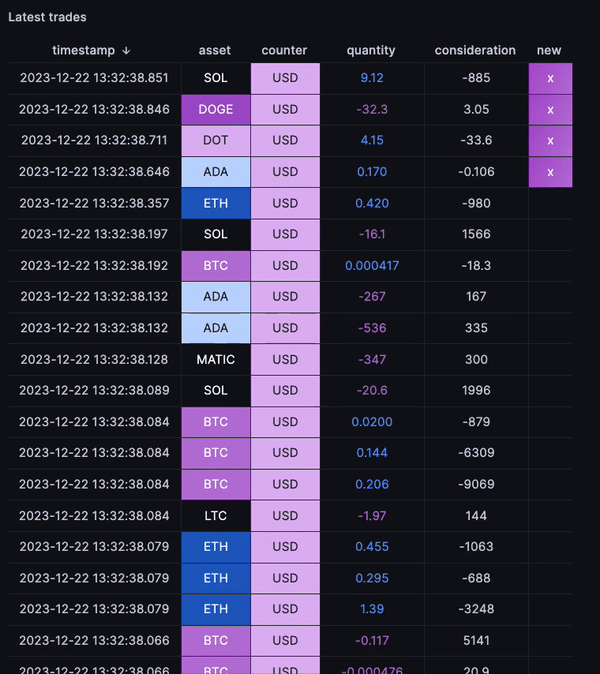
SELECT
  timestamp,
  left(symbol,strpos(symbol,'-')-1) asset,
  right(symbol,length(symbol)-strpos(symbol,'-')) counter,
  CASE WHEN side = 'buy' THEN amount ELSE -amount END quantity,
  CASE WHEN side = 'buy' THEN -amount*price ELSE amount*price END consideration
FROM trades
WHERE $__timeFilter(timestamp)
ORDER BY timestamp DESC
The trade data in the API and the database are stored as symbol pairs, for example: 'BTC-USD'. We apply LEFT/RIGHT functions to break down the symbol in the above example case. If we were to do this at scale, we would probably re-visit the ingestion step and the underlying schema so that the asset and counter currencies are stored in separate columns.
After applying some value mappings to the coin names to give them a unique colour, it becomes quite straightforward to see what assets are trading. If someone was to do a massive sweep against, say, DOGE on all possible pairs, you'd clearly see it stand out as there would be concurrent trades across multiple pairs where the common denominator is 'DOGE'.
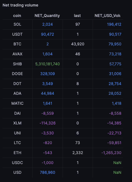
Building aggregates
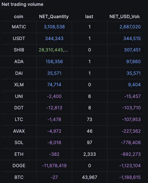
Breaking down each trade into its two components also makes it easy to build aggregates. For example, we can aggregate the amount of BTC bought or sold over a period of time. This allows us to better understand what's happening at an asset level.
For example:
- There may be a large seller on BTC-USD and a large buyer on BTC-USDT. Overall the volume nets out. There is just a net transfer from USDT to USD. But this would be difficult to gauge from looking at a trades list alone.
- There may be no activity on BTC-USD, but buy activity on ETH-BTC and concurrent sell activity on ETH-USD. The net result is sell activity on BTC against USD. Again, this is difficult to infer just from the trades flow.
One nice thing about Grafana is that you can build this over whatever time interval you want, and again, it refreshes in realtime. Basically, we compute: sum up by coin over an interval in realtime. we can also compare across time intervals, for example to infer that there is more/less pressure on a given coin at a given time.
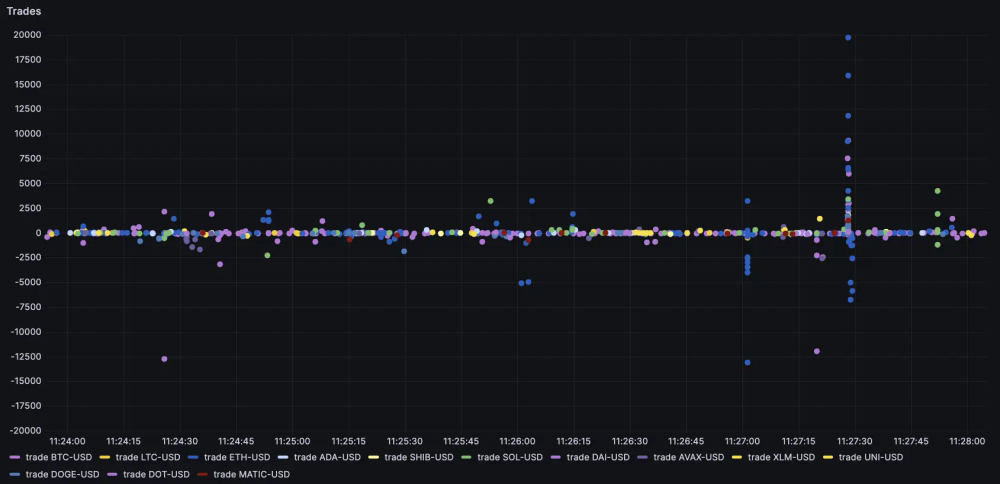
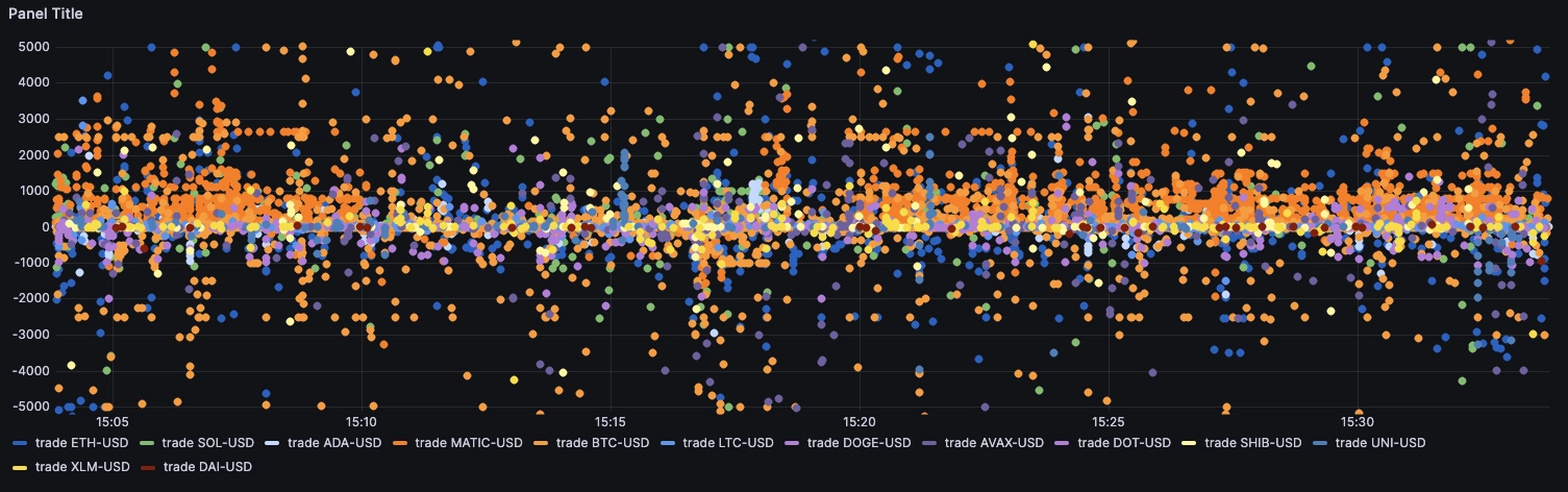
Visualising trades flow
A synthetic view of data combines multiple data points into a single, simplified representation. For example, the net trading volume aggregate is a synthetic view because it combines all individual trades into a single total volume. This provides a high-level overview but may lack detailed information about individual trades or specific points in time.
The rolling list of trades is extremely granular but not very synthetic. Conversely, a view such as the net trading volume aggregate is very synthetic but lacks the time component. One solid approach is to visualise trade flow over time with dots representing each trade normalized volume. The query for this is extremely clean:
SELECT timestamp time, symbol,
CASE WHEN side ='buy' THEN amount*price ELSE -1*amount*price END trade
FROM trades
WHERE $__timeFilter(timestamp)
If we invest in our colour scheme, we can end up with quite powerful insights. This sort of view is highly useful because we can instantly see from where the big trades originate. In the example below, it seems like someone placed a sweep on ETH:
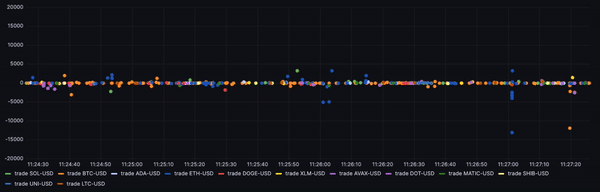
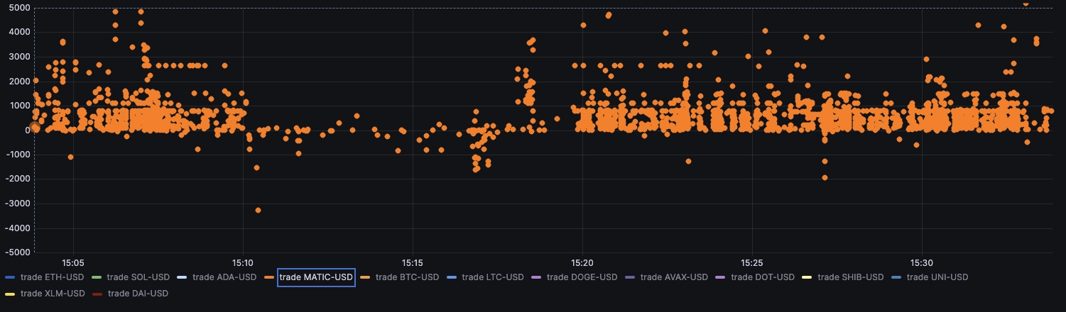
Another example where someone seems to be active on XLM. This view makes it stand out:
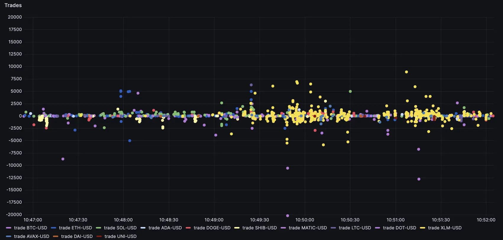
Of course, such volume of trades would also stand out in the trade watch. However, it would be difficult to judge the relative size of the trades from the table alone, unless we apply some size filters on the trade watch list.

Visualising relative activity
It can be hard to tell whether a currency is more active than usual. Typically, this is represented with volume bars at the bottom of a chart, but this chart is for a given currency pair only. One way around this is to use heatmaps based on volume and count of trades.
By using this sort of representation, we can see if a given currency is active compared to the timeframe. From there, it is easy to see which pairs are relatively active right now:
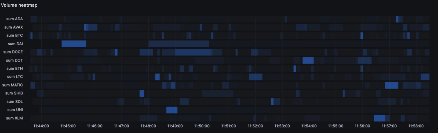
SELECT
timestamp time, left(symbol,strpos(symbol,'-')-1) asset, sum(abs(amount))
FROM trades
WHERE $__timeFilter(timestamp)
SAMPLE BY 5s
ORDER BY symbol, time
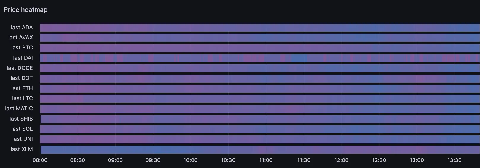
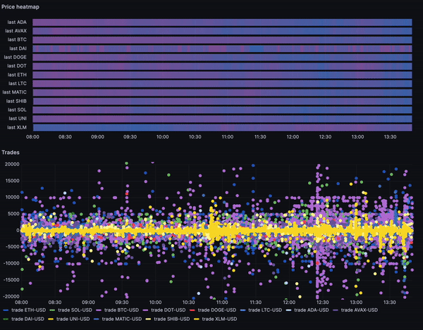
Visualising price action
It can be tempting to open many concurrent charts across all pairs. But this is not infinitely scalable, since our screen real estate and field of vision are limited. One way to represent price action in a synthetic way is to use Grafana's heatmap over time visualisation. This shows how the various prices have been trending in the target time period. For example, the below shows that most coins have been trading down since the morning… except XLM.
Replay
A distinct advantage of building this sort of dashboard ourselves and storing the underlying data is that we gain the ability to replay what happened at our own pace. This can be helpful for training, backtesting and similar, or simply to look in more detail at what's happening at a slower pace.
In the example above, one may wonder what happened to XLM. It seems pretty de-correlated from the other coins. We can see there was a spike of trading activity around 10:45 and 13:00. This coincides with price jumps:
Putting it together: hunting orders
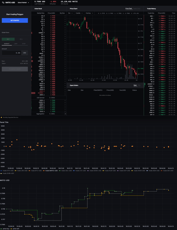
With this sort of analysis, we can sniff orders and infer who is trading what. For example here, we can see two patterns. First, some dots are strangely aligned horizontally, forming a line. Second, there is a lot of them forming an area above the 0 mark.
At first glance, it looks like someone could be buying MATIC with an algo. For example, they may be using a Time-Weighted Average Price (TWAP) and releasing a fixed quantity at a given interval. But perhaps we'll find that's not exactly the case...
It becomes even more apparent when we focus on MATIC trades:
We can see most trades are buy trades. So looking at the volumes, MATIC is topping the charts for net trading volume. As one may intuit, all trades have one buyer and one seller. The 'buy' or 'sell' flags are defined by who initiates the trade, or who is the 'aggressor'.
From this perspective, it seems like there could be a buyer.
... Or is there?
Who is hunting who?
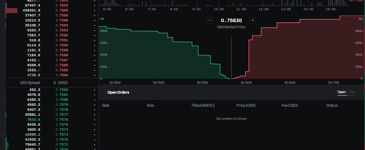
If we zoom out, we can try and look at what is happening to that coin today. It's slightly down, but more interestingly, the price seems to be capped at 0.76 for the last hour. This seems to indicate that there is a large order sitting at that price, and that all the trades in the recent history are probably against that order:
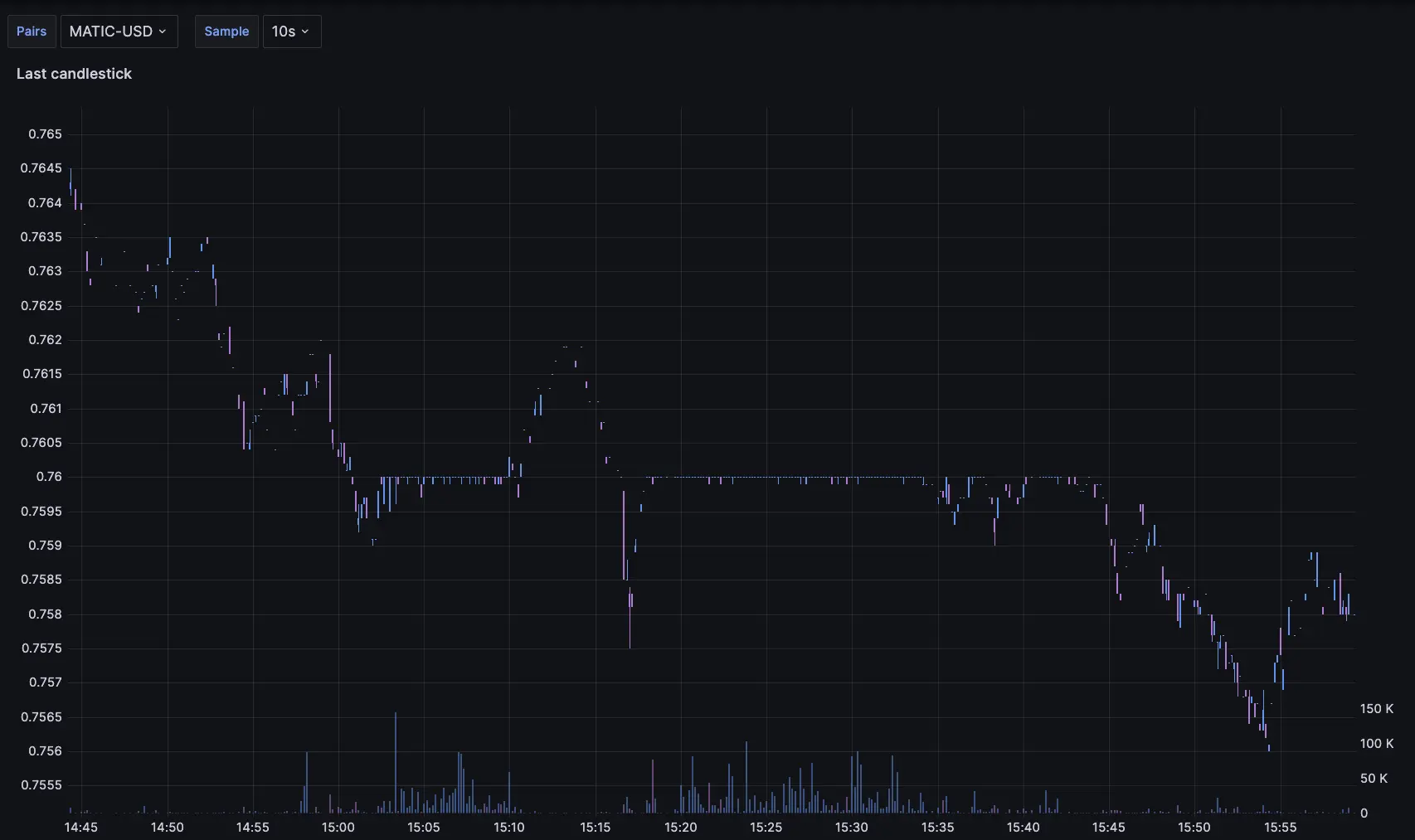
We can see the order in the book, and the resulting liquidity wall it's forming on the ask side:
While it may initially have looked like someone was shopping for MATIC, it now seems likely the trades are the result of different Market Making (MM) algos hitting the static order when their fair value goes above 0.76. That would explain the relative consistency in execution sizes and why the buying activity seems to drop when the price goes down from 0.76. If there was an actual motivated buyer, then they would increase their buying velocity when the price gets lower, not decrease it.
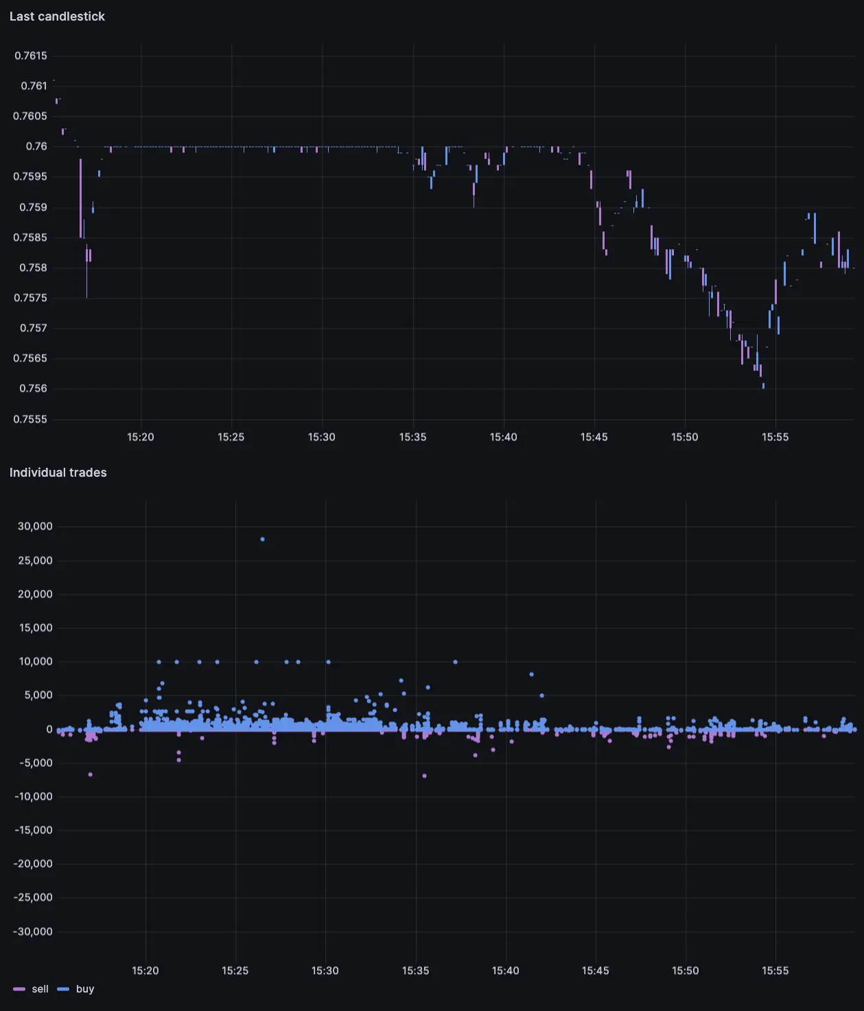
So… what appeared to be buying pressure on MATIC seems to actually be a sitting seller being hit by market makers quotes when they cross his price, and this has been happening over and over, and will continue happening until the order is taken out.
We have an instance of this happening. As the market makers quotes cross the order level, they all crash against the resting limit causing a bunch of executions:
So, we haven't really found a buyer. In fact we've found a seller. But the seller is obvious with a large limit rather than trying to hide behind an algo as we initially thought. Maybe there isn't an opportunity after all, but we can move on to the next one.
In the end, it's up to everyone to come to their own conclusions and make their own decisions. But hopefully, by building your own system, you can gain better awareness of what's going on, and can make better, or at least more informed, trading decisions with all the data and analytics solutions right at your fingertips.
Summary
In this tutorial, we've walked through the process of building a custom trade watch. We've learned how to aggregate and visualize market data for efficient trading using Grafana and QuestDB. This approach enhances our financial market analysis, providing a more comprehensive view of trading activity. With these tools, we can spot patterns and trends make more informed trading decisions.
Ready to build your own? Consider QuestDB for your next financial use case.
Checkout our real time crypto dashboard for further inspiration.